Web Design Standards: Guidelines for Consistency

One of the things that make a website looked polished and on-brand are web design standards they’re based on. That’s right, at the core of every great website you’ve visited lays a set of unified design principles established to bring order to what could quickly turn to chaos.
What Exactly Are Web Design Standards
The web standards movement got started in 1998 and has developed tremendously since that time. The most commonly used web design standards by developers have come from the World Wide Web Consortium (W3C) although some have come from other organizations like the International Organization for Standardization (ISO).
Essentially they are a communal set of tools and concepts which, when employed correctly, create consistent, beautiful, and easy-to-use websites.
Why is that so important?
For starters, did you know that 94 percent of first impressions on any given website is design-related? And, on top of that, 88 percent of users say they won’t even return to a site if they have a bad experience. But, what makes a user experience good versus bad?
Web design standards are designed to tell us just that.
Some examples of web design standards that relate to the physical appearance of a website might include guidelines on the following:
- which fonts to use
- font sizes
- which colors to use and where
- the style of clickable buttons
- navigation menu placement (Web design standards say it should be across the top of the page)
- location of the Contact Us button (It’s best practice to add this button to the upper right-hand corner)
- where to put the search feature
And so on…
Of course, web design standards also go as deep as how the code for websites is written…

Web Design Principles Aren’t Just About Aesthetics Either

Some of the most obvious benefits include consistency, usability, clarity, and branding. A lot of this directly relates to the aesthetics, but not all of it.
Web design standards give users a predictable experience, helping make the process of navigating your website easier and intuitive. This is both visual as well as hidden behind the scenes in the code.
There are less visually obvious benefits as well including:
- Ensuring sites are backward compatible with older browsers
- Improves forward compatibility, making sure they will still display correctly on new browsers
- Provides a more stable web experience across all types of devices such as laptops, tablets, and smartphones
- When coding design standards are employed, they also increase search engine ranking by ensuring they are indexed properly
- 508 compliance which ensures websites are able to be accessible by individuals with disabilities
FURTHER READING: Advocate and Service Provider for the Rights of Individuals with Disabilities: CORD (Cape Organization for Rights of the Disabled)
Clearly, those are all important to the way visitors interact and, ultimately, perceive your website. Additionally, they make the development of your site, both present and in the future, easier, more organized, and faster.
With all that in mind, applying web design standards to your website is a no-brainer. Yes, your website should use them!
Where To Find Web Design Standards
What’s great about working with a developer or agency like 3 Media Web to build or redesign your website is that they’ll come well versed in web design standards. After a consultation to establish a clear vision of your brand needs, they’ll know which standards will most effectively reach your goals.
There are also plenty of resources available online as well.
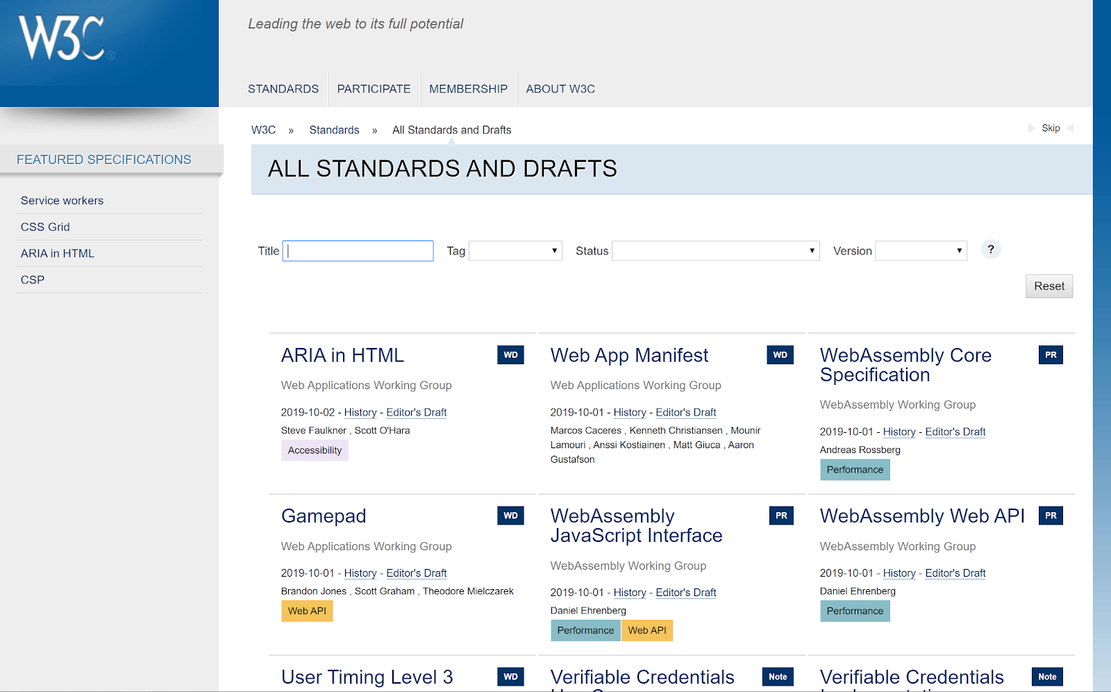
We’ve already mentioned the web design standards put in place by W3C. There’s a lot of information on this site, but that’s what makes it one of the most comprehensive collections of web design standards. It’s always growing and improving thanks to the open-source developer community that operates it.
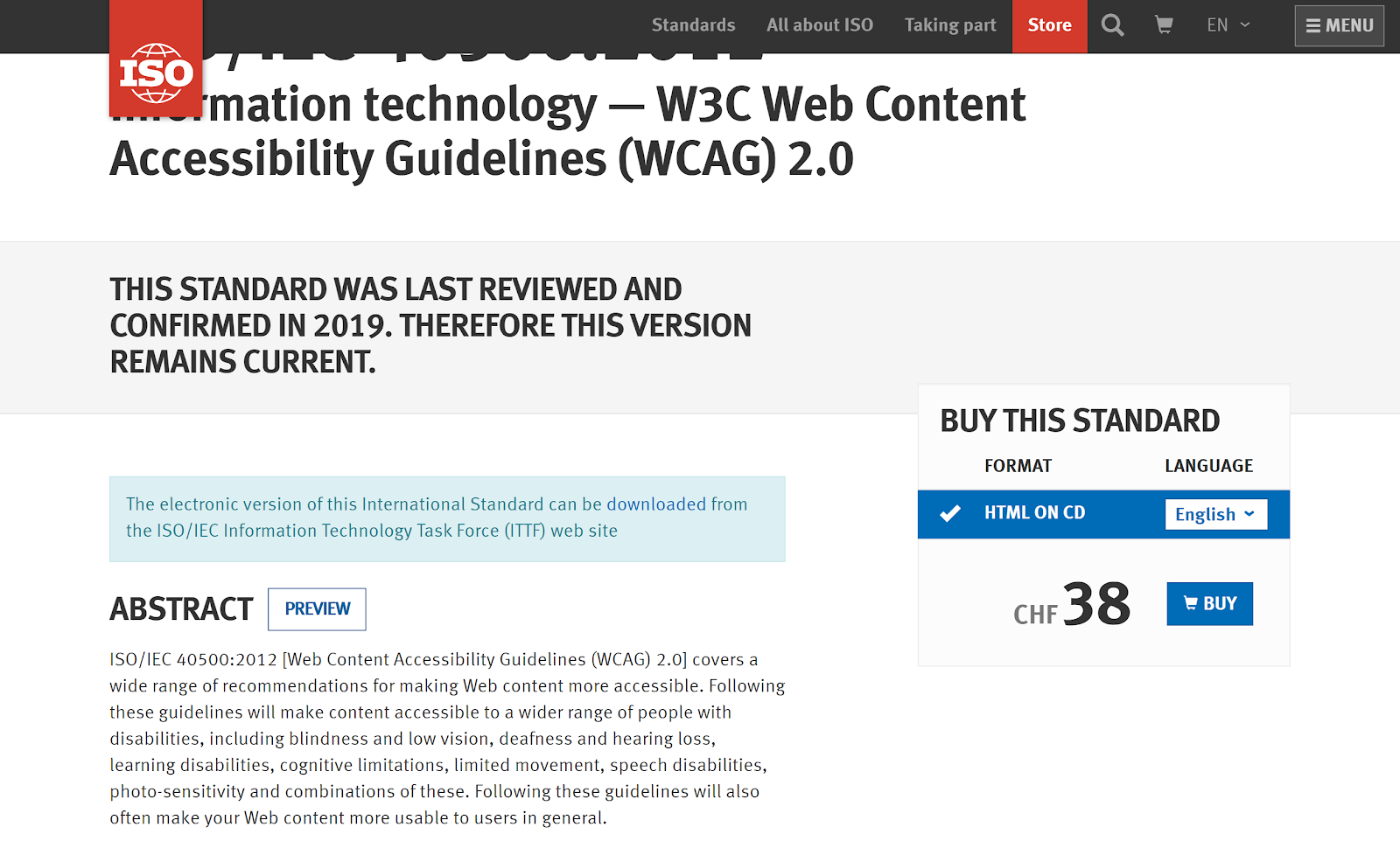
There’s also the ISO set of web standards which we also mentioned previously. These standards aren’t as comprehensive as W3C, but the two do interplay with one another.
Their complete list of standards currently available can be found here.
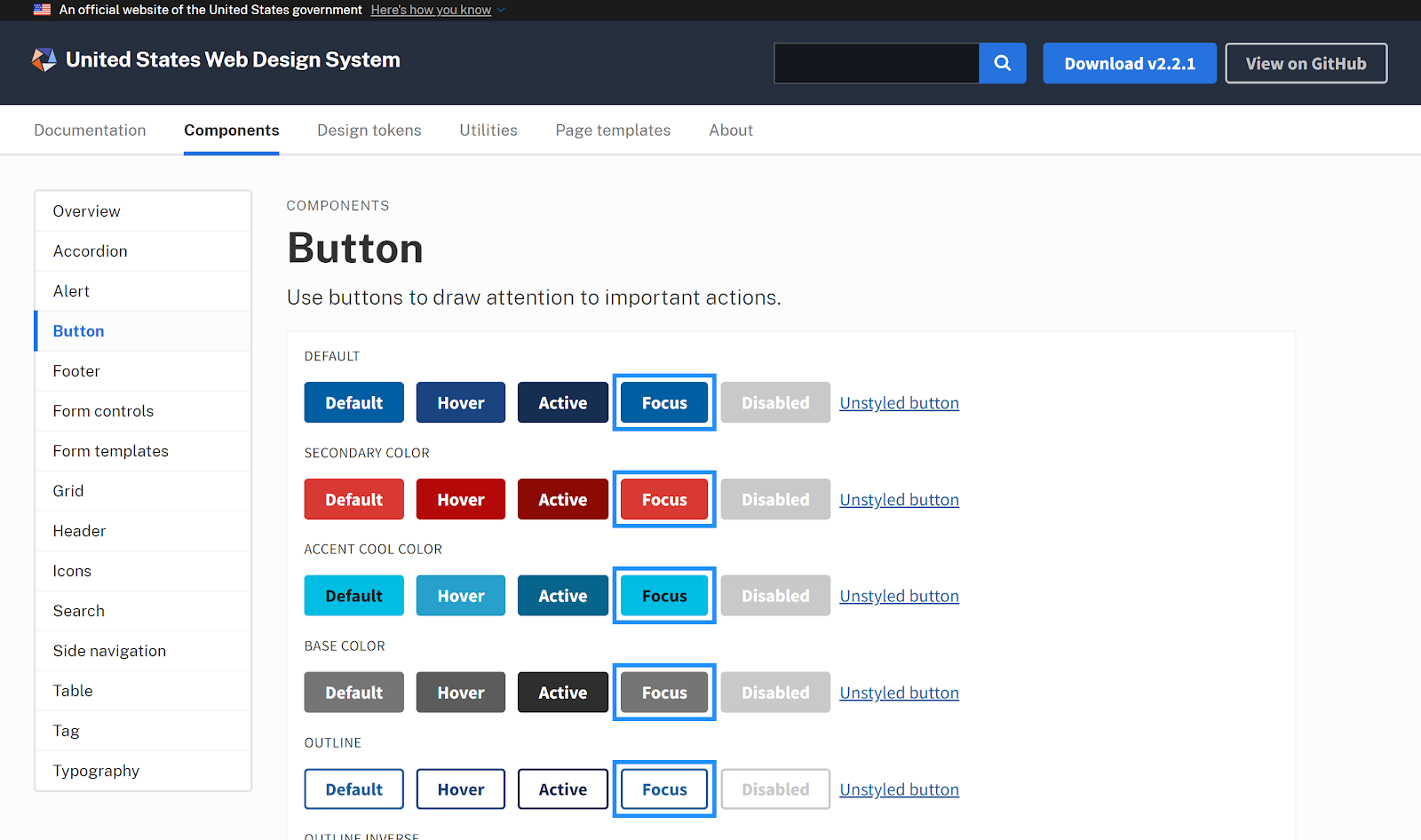
Another research avenue you may want to peruse is the United States Web Design System. That’s right, the United States government has its own set of web design standards that help them keep a cohesive feel across all government websites. You can find them here.
They include things such as a style guide to dictate which fonts and colors to use as well as common user interface components such as buttons and other elements commonly found on websites.
12 Web Design Guidelines To Build A Better Website
Web design standards are a communal effort. They’re about what works best for most people and the best way to figure that out is through consensus. You should always remember to use these web design guidelines:
- Master The Tangibles: What is your website trying to accomplish?
- Keep It Simple: Minimalism can give your website a clean, polished look.
- Match Your Site to Your Business: If your business is the opposite of minimalist, a minimalist website isn’t for you.
- Design For Users: Make sure your design team, design plans, and managers are all thinking about your users, not your own design wants.
- Pay Attention to Details: Good website copy sells and influences users. Pay attention to ever word on your business website.
- Use Accessible Web Design: All of your website visitors need to be able to physically read it, so use accessible web design standards.
- Make Navigation Easier: Hamburger icons may make your website navigation easier, with its compact style and high recognition factor.
- Design For Mobile First: 50 percent will stop visiting your site if the mobile experience is bad.
- Pay Attention to Customer Experience: The experience customers have on your website should be the top design priority, on both mobile and desktop.
- Build In Your Data Sources: Digital marketing data will help you make business decisions and continue to adapt your website to successful website visitors.
- Make Customer Feedback Easy: Customers should be able to send you feedback easily, through survey questions or direct contact forms.
- Consider Agency Help: Don’t be afraid to hire a reputable web design agency if you can’t deliver the right website all by yourself.
Fortunately, there are tons of people out there who study web design standards and are actively participating in the conversation about it. That means there are many additional resources available outside of the highly technical guides we linked to in the last section.
FURTHER READING: Four Necessary Steps to Take Before A Website Redesign
Whether you’re inspired to do a complete overhaul or are looking for small changes to improve your website, these articles can help. Let’s take a closer look at some of these web design guidelines.
Master The Tangibles

Before you start writing code for your new website or thinking of what fonts, colors, and imagery to use, you need to have a plan.
What is each page trying to accomplish? Where do you want the user to go from the page they’re looking at? How does the website interlink with itself?
Remember, first comes the plan, then comes the design and content.
As this excellent ebook from UXpin teaches:
“Figure out the UX goals of each page, then start mapping out the messaging for each site section. Examine the relationships between pages, and once it all makes sense, start actually creating your content (text and images). When you have workable drafts, you can then start wireframing and prototyping around the rough content. The approach gives you a solid foundation of content to sculpt your design around.”
Current Trends: Is Minimalism The Way To Go?
Yes and no.
The minimalist trend has been around for a long time. More and more web developers and website owners are using the style choice to give them a clean, polished look over edgy designs.

An interesting note from the ebook we talked about above details the trend of minimalist design and why it works so well in modern web design.
…and why sometimes it doesn’t work at all.
There are certain types of businesses and sites which minimalism works well on, but it has its limitations just like any design concept. E-commerce sites, like Amazon, for example, would be underserved by minimalist design because they are too complex.
Of course, that’s not saying it’s impossible, but extra-thought does need to go into it to pull it off. Something to keep in mind!
Small Tweaks Have A Big Impact
It’s common knowledge good copy sells and is an integral part of any business website. But what’s talked about less is how it’s displayed.
As Business2Community so accurately points out:
“With all the more complex design decisions of landing pages to distract us, it’s easy to forget the simple fact that readership equals revenue. If our copy is hard to read, it won’t get read.”
They’re not just talking about the phrasing of your content either.
Since the copy is what inspires people to purchase from your website, they need to be able to physically read it. That means using a clean font at a size that’s easy to see.
That means no unusual cursive fonts for page copy. And don’t even think about using a pixel value to set the size of the font. Since all screens will vary in size and pixel density, what is 14px on one device may look completely different on another.
There are web design standards dealing with the coding end of things that allow developers to set the font size to a percentage instead of a pixel size. That way, the browser will automatically render the text in an ideal size to be viewed on that device.
Current Trends: The Iconic Hamburger Icon
Does the icon in the upper right-hand corner look familiar? The one that’s three bars stacked on top of one another?
Chances are you’ve encountered the “hamburger icon” on more than a few occasions while browsing the web.
This may seem a bit like a wildcard on the list, but, for better or worse, this icon has become nothing short of iconic. This deliciously named icon is everywhere on the mobile web. And the hamburger icon is diligently trying to extend its reach to desktops and other applications too.
It’s a great example of a web design standard and how they work–it’s achieved widespread recognition by people as a clickable option to see a menu. This was possible thanks to web designers worldwide adopting it as a web design standard.
“For designer/developers, the main draw for using the hamburger icon in a desktop application is the ‘clean factor.’ Minimalist design continues to gain popularity, so of course, the impulse would be to strip away everything but the most basic elements.”
Though the hamburger icon does have its disadvantages, it still serves up exactly what it was intended to do–simplify navigation.
By giving the option to hide cumbersome navigation menus by keeping them tucked away until clicked, the hamburger icon provides a working solution that satisfies modern design trends.
Does Your Website Deliver A Great Customer Experience?
You know the old saying, “don’t judge a book by it’s cover?” As good as advice as it is, the majority of people will disregard it entirely when it comes to your website.
In fact, 57 percent of people will not recommend a business if their mobile website experience is poorly designed. And 50 percent will stop visiting your site if the experience they have when visiting your site is bad.
The facts speak for themselves. But, the reality is, they’re easier said than done. What even makes for great customer experience when it comes to websites?
What Makes a Good Customer Experience?
According to this HubSpot survey, the answer is pretty straightforward.
Seventy-six percent of those polled in the study agree that the most important aspect of web design is that the site makes it easy for visitors to find what they want.
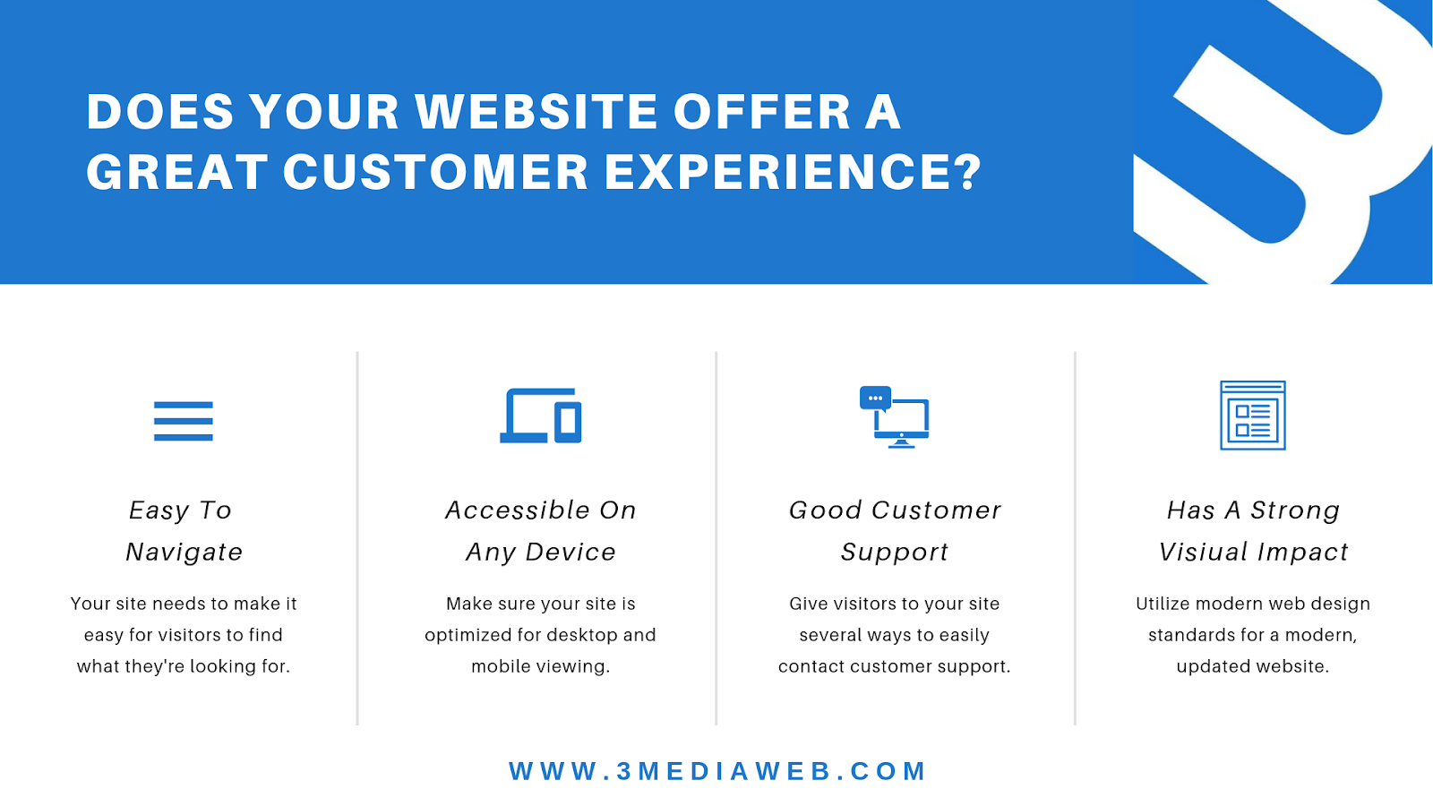
That’s good news if you’ve been paying attention to the current web design standards. They’ll play a major part in making sure your website meets these goals.
DIY Or Agency?
What’s great about the web design standards being so freely available is that anyone can access them and apply what they’ve learned to their own web design. On top of that, there are plenty of templates available for novice website developers to work with.
But, are those really any good?
It’s a common question, you’d be surprised how often clients come to us asking it. We even wrote an entire article on it…
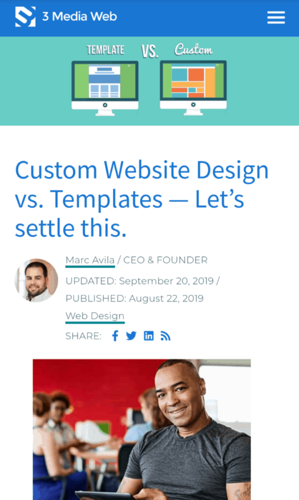
FURTHER READING: Custom Website Design vs. Templates — Let’s settle this.
As often as people ask us if templates are the way to go, you’d really be surprised to learn how often business owners come to us after having spent copious amounts of time and resources working with a template only to never be able to fully realize the vision they had for their site.
Based on our experiences and the experiences of some of our past clients have had before coming to us, we’ve concluded it worth the money to work with a web design agency or individual. Especially if you’re serious about growing your business.
The consensus says:
Templates = Amateur
Custom Web Design = Professional
That being said, as the article states, there are few instances where a template might work for you. If you just need a basic website with basic information and don’t plan on upgrading the site in the future, a template may be the way to go.
However, if you’re thinking about piecemealing together a quick and dirty site with the hopes of redesigning and upgrading it in the future, a template will turn out to be more hassle than it’s worth.
Why?
Because you’ll be starting from scratch all over again, racking up more time and money that goes into your website.
We’ve covered a lot of ground today, but there’s still a lot to learn when it comes to web design standards. If not sure where to start or want to talk to an expert in the matter, feel free to reach out to us with your questions.
The 3 Media Web team is here to help.