Last updated: August 2, 2026
- Effective biotech web design makes complex science understandable without stripping away the evidence experts need.
- The strongest sites create different paths for researchers, investors, partners, patients, buyers, and prospective employees.
- Scientific illustrations, pipeline diagrams, publications, leadership credentials, and clear disclaimers build more trust than generic innovation language.
- Accessibility, mobile performance, security, search visibility, and a maintainable CMS are design requirements—not post-launch extras.
- The 23 examples below were selected for a specific strength that biotech and life-science marketing teams can adapt.
- A polished homepage cannot compensate for outdated pipeline information, weak content governance, or unclear conversion paths.
The best biotech website designs do more than look innovative. They help scientists verify the detail, investors understand the pipeline, partners see a strategic fit, patients find appropriate information, and marketing teams keep the story current. This guide reviews 23 current examples and explains the design, content, SEO, accessibility, security, and conversion principles behind them.
What Are the Best Biotech Website Designs?
The best biotech website designs are the ones that make the company easier to understand, evaluate, trust, and engage—not simply the ones with the most dramatic animation.
A scientist may want mechanism-level detail. An investor may want the pipeline, milestones, and leadership team. A potential partner may need to understand the platform and collaboration model. A patient or caregiver may need plain-language information and clear boundaries around investigational products. A candidate may be deciding whether the mission and culture are credible.
Strong biotech web design gives each audience enough information to take the next step without forcing every visitor through the same generic corporate story.
The examples below are not ranked by visual taste. Each was selected because it shows one or more useful strengths across positioning, scientific storytelling, audience routing, evidence, user experience, and scalability.
For a closer look at what B2B buyers in this space now expect, see our guide to what B2B buyers now expect from a biotech site.
For help applying these principles to your own site, explore 3 Media Web’s biotech web design services.
How We Evaluated These Biotech Websites
We reviewed each website against six practical questions:
| Evaluation area | What we looked for |
|---|---|
| Positioning clarity | Can a relevant visitor understand what the company does, for whom, and why it matters without decoding vague marketing language? |
| Scientific storytelling | Does the site layer the science so a general business reader can grasp the idea while a technical reader can reach the evidence? |
| Audience routing | Can investors, scientists, partners, patients, buyers, and candidates find the content and action relevant to them? |
| Evidence and trust | Are programs, publications, leadership credentials, partners, trial information, disclaimers, and other proof easy to locate? |
| Experience quality | Is the site readable, responsive, accessible, fast, and restrained enough that visuals support rather than block comprehension? |
| Conversion and scalability | Does the site create meaningful next steps, support measurement, and appear maintainable as the pipeline, products, or company evolves? |
This is a qualitative editorial review, not a formal accessibility audit, penetration test, or Lighthouse benchmark. A visually strong site may still have technical issues that are not apparent from public pages.
The 23 Best Biotech Website Designs for 2026
| Website | Standout strength | Best lesson to borrow |
|---|---|---|
| Generate:Biomedicines | Platform positioning | Connect a bold category idea to concrete programs and pipeline information |
| Ambagon Therapeutics | Scientific focus | Own a precise scientific category instead of leading with generic innovation language |
| Mammoth Biosciences | Capability routing | Separate distinct offerings without fragmenting the brand |
| Fractyl Health | Product architecture | Give each platform or product a clear role, audience, and path |
| Pretzel Therapeutics | Concept system | Use a consistent visual and verbal system to make a difficult scientific domain more approachable |
| Volastra Therapeutics | Memorable scientific narrative | Turn a complex mechanism into a concise, ownable story |
| Cambrian Bio | Portfolio storytelling | Use a coherent brand system to connect a portfolio of programs |
| Bicara Therapeutics | Program urgency | Lead with a strong mission and guide visitors quickly to the clinical program |
| Imvax | Layered science | Combine an accessible overview with deeper platform and pipeline content |
| Faeth Therapeutics | Focused pipeline communication | Make one lead thesis and its investigational status unmistakable |
| Beam Therapeutics | Platform-to-patient connection | Connect foundational technology to programs and human relevance |
| Allay Therapeutics | Distinctive visual identity | Use a memorable visual idea without losing clarity |
| Alnylam Pharmaceuticals | Human-centered voice | Balance technical confidence with language that acknowledges patients and people |
| Merida Biosciences | Focused positioning | Keep an early-stage company site concise without becoming vague |
| Apollo Therapeutics | Partner and portfolio model | Explain how the business works, not only what the science is |
| Phathom Pharmaceuticals | Multi-audience trust | Give healthcare, investor, product, and medical-information audiences distinct paths |
| Minerva Neurosciences | Research credibility | Keep programs, publications, and investor information easy to reach |
| CELLTREAT Scientific Products | Product discovery | Pair brand personality with serious search and catalog usability |
| LuminUltra | Solution architecture | Help technical buyers navigate by industry, problem, and application |
| MatTek Life Sciences | Catalog organization | Use category-led navigation for a broad scientific product set |
| OpenClinica | Role-based conversion | Connect audience-specific paths, resources, and persistent next steps |
| Asimov | Complex offering architecture | Show how products and services fit together without forcing users to decode the stack |
| Hexagon Bio | Concise positioning | Say what the company is building in a few precise words, then provide technical depth |
Clear Science and Platform Positioning
1. Generate:Biomedicines
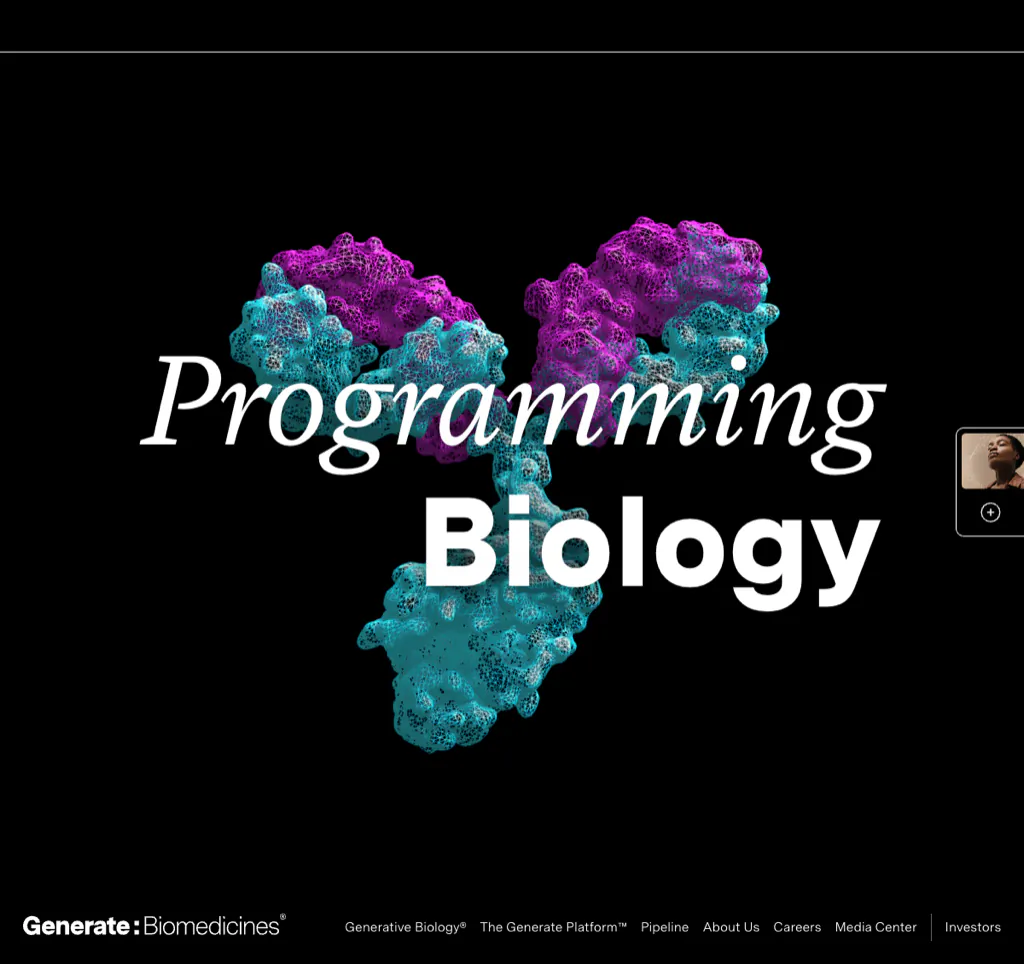
Generate:Biomedicines leads with the category-level idea of “Programming Biology,” then supports that claim with direct paths into its platform, pipeline, and company story. The phrase is memorable, but the site does not expect the headline to carry the entire explanation. Visitors can move from the high-level premise to specific capabilities and programs.
That sequence is useful for biotech companies with an unfamiliar platform: establish the idea, show how the system works, and then connect it to real development activity.
What to borrow: Pair a distinctive category statement with immediate evidence. A bold claim without a platform explanation or pipeline will read as branding rather than substance.
2. Ambagon Therapeutics
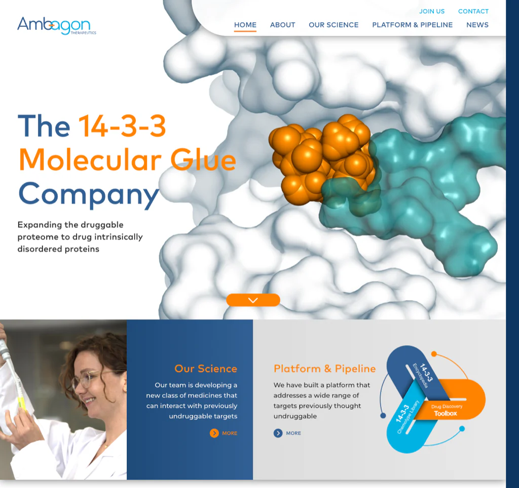
Ambagon describes itself as “The 14-3-3 Molecular Glue Company.” That is specific enough to signal a clear scientific focus and create curiosity without relying on empty phrases such as “transforming medicine.” The site carries the same visual language through its platform and pipeline content, helping technical pages feel like one coherent story.
For early-stage biotech companies, specificity is often more credible than trying to sound broad. A visitor should not have to reach the About page to understand the category the company intends to own.
What to borrow: Use the homepage to stake out a precise scientific position, then make the navigation and page titles reinforce it.
3. Mammoth Biosciences
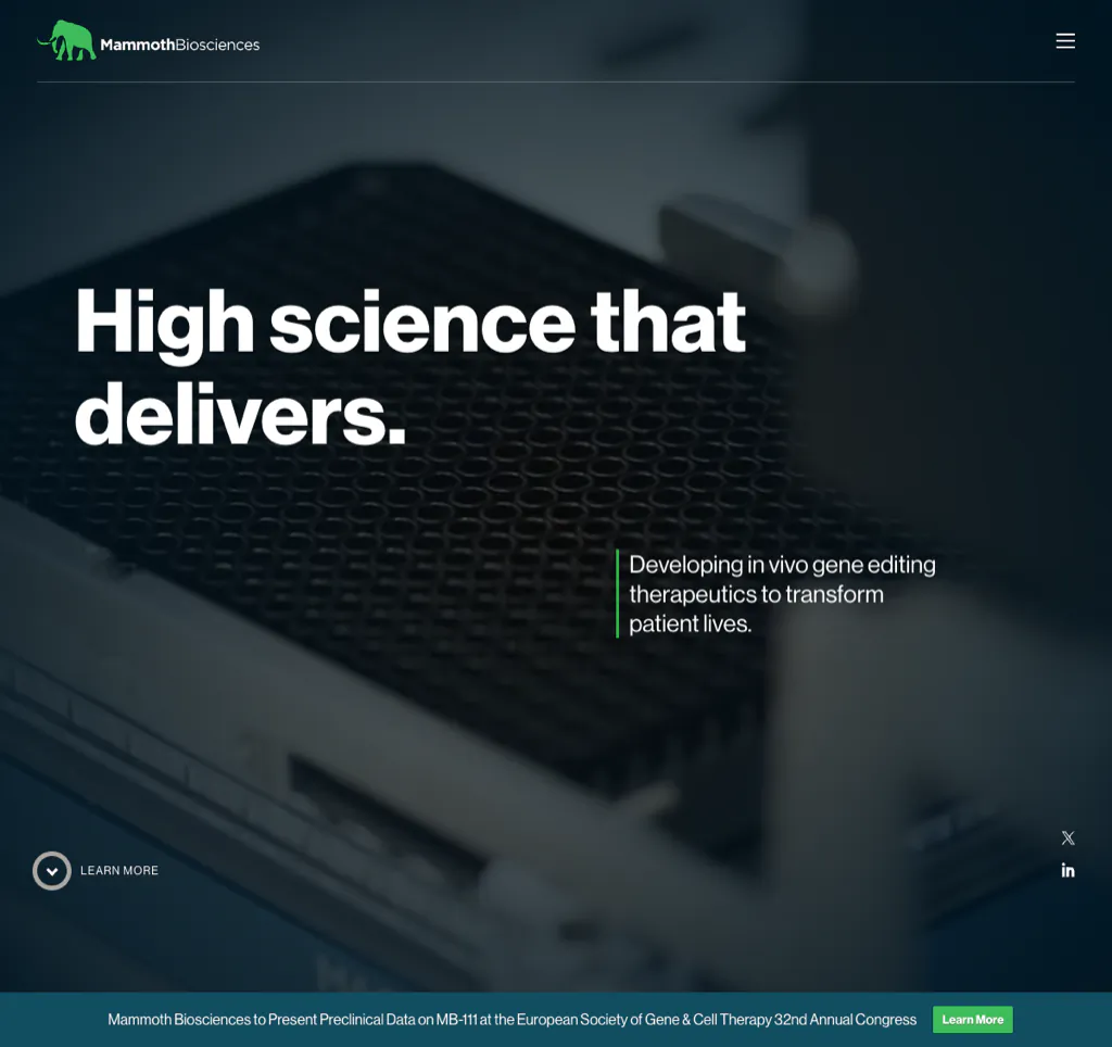
Mammoth uses the compact promise “High science that delivers” while creating distinct paths into therapeutics, protein discovery, and diagnostics. That separation matters because a multi-capability biotechnology company can easily make its homepage feel like three unrelated businesses.
The site’s value is not simply its visual polish. Its architecture gives different visitors a clear way into the part of the company relevant to them while maintaining a consistent brand and scientific foundation.
What to borrow: When the company has multiple capability areas, define the relationship among them and give each one a clear destination. Do not place every audience and offering into one long homepage narrative.
4. Fractyl Health
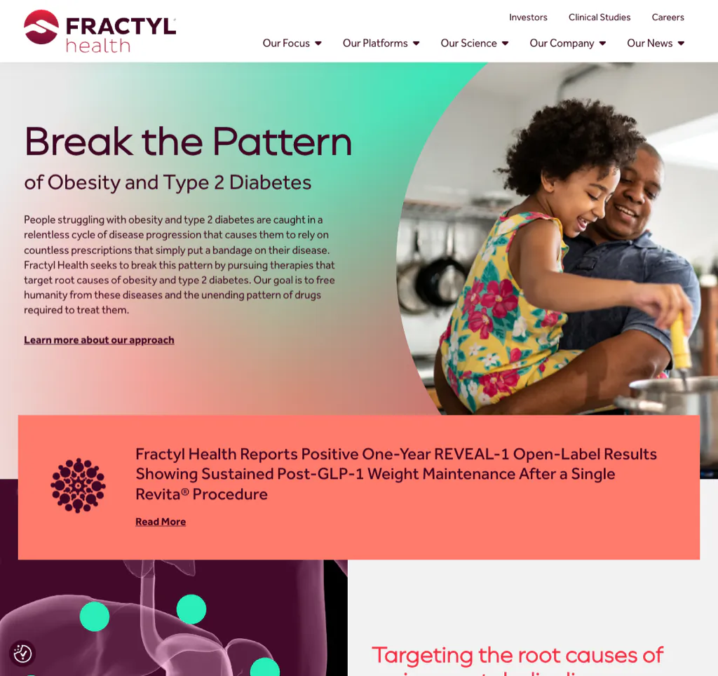
Fractyl’s “Break the Pattern” message creates a strong narrative around treating the root causes of metabolic disease. The site then separates its Revita and Rejuva platforms so visitors can understand that they represent different approaches, not interchangeable brand names.
The site also shows an important life-science discipline: visual storytelling and scientific ambition are paired with visible investigational and regulatory context. That protects clarity without draining the brand of energy.
What to borrow: Give each platform, product, or program a clear role and use consistent labels everywhere. When a treatment is investigational, make that status obvious rather than burying it in a footer.
5. Pretzel Therapeutics
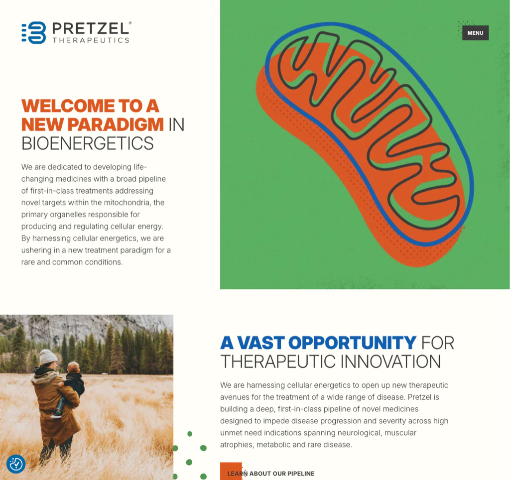
Pretzel Therapeutics operates in a difficult storytelling space: mitochondrial biology and bioenergetics. The website uses a strong conceptual identity and focused navigation to give visitors a way into the science, platform, pipeline, and disease context. It does this without presenting a wall of molecular detail on the homepage.
The design succeeds when the visual system acts as a guide to the content rather than a decorative layer. It creates a recognizable company identity while leaving room for scientific depth.
What to borrow: Develop a visual system that reflects the scientific idea, but test whether a new visitor can still explain the company after the first screen.
6. Volastra Therapeutics
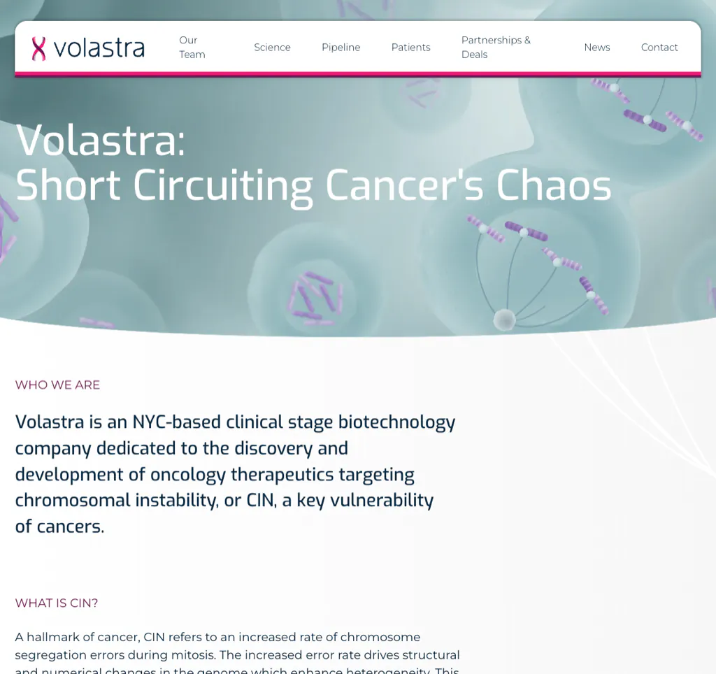
“Short Circuiting Cancer’s Chaos” gives Volastra a memorable way to introduce its focus on chromosomal instability. The phrase simplifies the opening idea, while the platform and pipeline pages provide the technical detail needed by scientific and investment audiences.
The lesson is not that every biotech company needs a clever slogan. It is that a complex mechanism benefits from an accurate narrative device that can be carried through diagrams, headings, and program descriptions.
What to borrow: Find the simplest truthful idea that connects the scientific mechanism to the problem being addressed, then use it consistently across the site.
Pipeline and Complex-Data Communication
7. Cambrian Bio
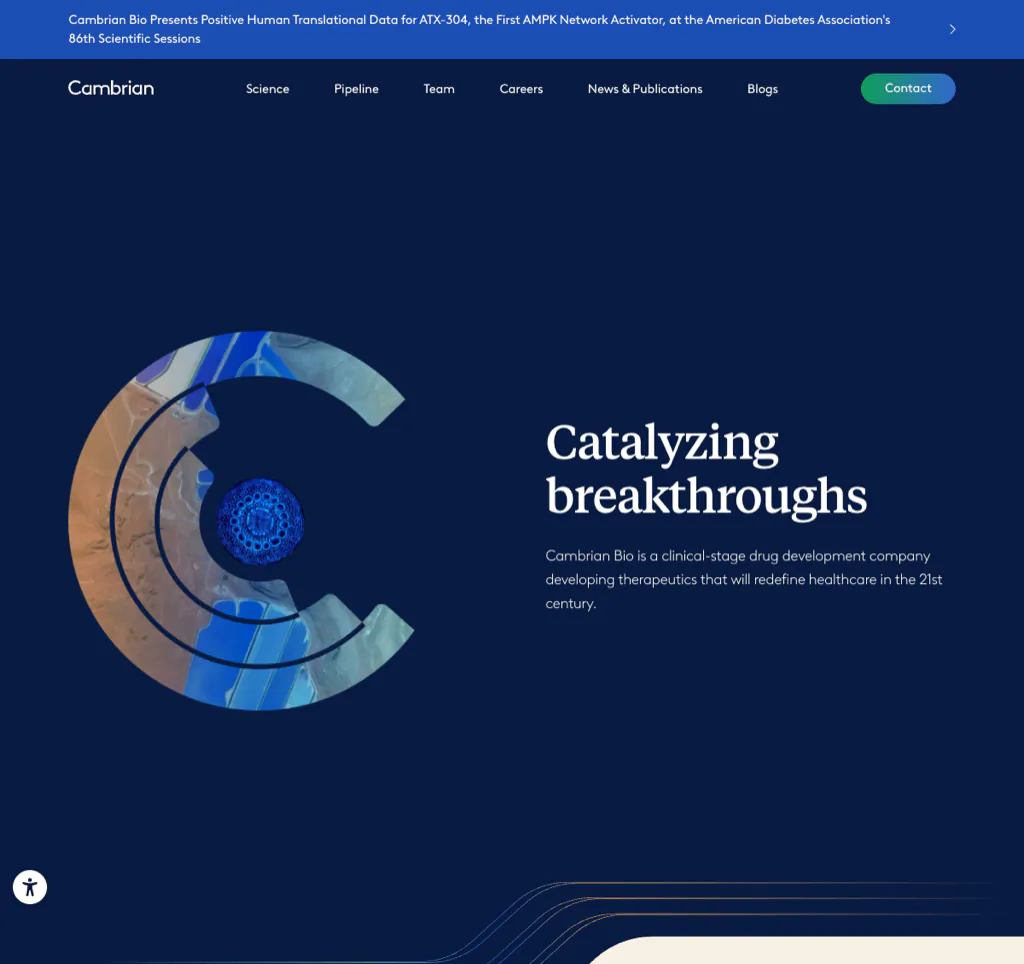
Cambrian’s site uses a premium, coherent brand system to connect its company story, scientific thesis, and portfolio. Full-page color, typography, and repeated visual motifs give the organization a distinct identity without making every portfolio company or program compete for attention on the homepage.
Portfolio businesses have a difficult architecture problem: the parent company must explain its model and credibility while still giving individual programs enough visibility. Cambrian shows how a strong system can create continuity across that complexity.
What to borrow: For a portfolio model, explain how programs are selected, supported, and advanced. A grid of logos is not a strategy explanation.
8. Bicara Therapeutics
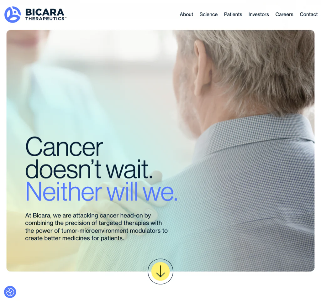
Bicara leads with the urgent line “Cancer doesn’t wait. Neither will we.” and creates a direct route to its lead program and patient-facing information. The site uses visual energy, but the central clinical story remains easier to find than the animation.
That balance is important for clinical-stage companies. A strong brand can create confidence, but users still need rapid access to indication, program, trial, publication, and company information.
What to borrow: Let the emotional mission establish urgency, then move quickly to the program and evidence. Do not make an investor or clinical visitor scroll through a brand film to find the pipeline.
9. Imvax
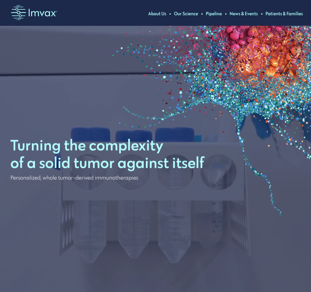
Imvax creates a layered journey through its science, pipeline, patient information, and company updates. Visitors can understand the broad premise first and then reach more detailed descriptions without the homepage trying to reproduce the entire scientific deck.
The site’s use of media and scientific visuals is most effective where it makes the process easier to understand. Motion can be useful in biotech when it explains sequence, relationship, or mechanism—not when it merely makes the page feel active.
What to borrow: Give every complex science page a short overview, a visual explanation, and a clear path to deeper evidence or publications.
10. Faeth Therapeutics
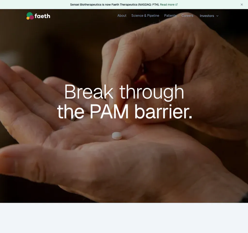
Faeth is a current example of focused corporate storytelling after a major organizational change. The site centers on a clear scientific thesis, its lead PIKTOR program, and a compact pipeline rather than trying to preserve every element of the predecessor company’s story.
The site also uses clear investigational language around programs. That distinction matters because enthusiastic marketing copy can otherwise blur the line between a scientific hypothesis, a clinical program, and an approved treatment.
What to borrow: After a merger, acquisition, or rebrand, rebuild the information architecture around the current company—not the history of the old navigation. Make program status explicit.
11. Beam Therapeutics
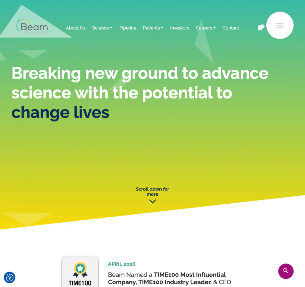
Beam connects its base-editing platform to programs, pipeline information, news, and a broader patient-oriented mission. The site uses polished visual design and motion, but it remains possible to reach the scientific and corporate information expected from a public biotechnology company.
A platform story is most persuasive when users can see the connection from underlying technology to therapeutic strategy. Otherwise, the site risks becoming a collection of impressive but disconnected claims.
What to borrow: Build an explicit bridge from platform, to program selection, to pipeline, to potential patient impact.
Human-Centered Storytelling and Audience Trust
12. Allay Therapeutics
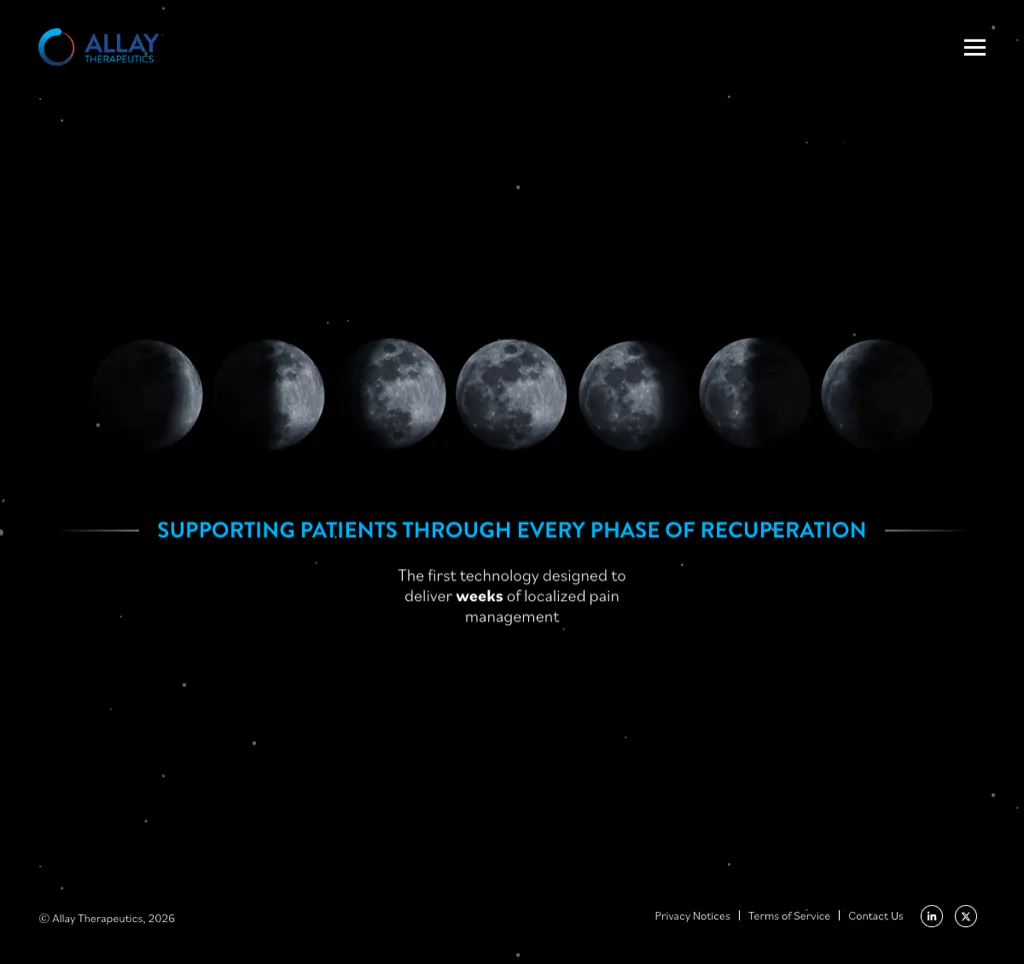
Allay uses a distinctive dark visual palette and a memorable lunar theme to support its story around sustained post-surgical pain management. The site feels different from the common white-and-blue biotech template, which can help an early-stage company become recognizable.
The risk with any strong theme is that the metaphor becomes more memorable than the therapy. Allay works best where the visual concept supports a clear explanation of the problem, approach, and pipeline.
What to borrow: A distinctive visual identity can improve recall, but the first screen must still state what the company is developing and why it matters.
13. Alnylam Pharmaceuticals
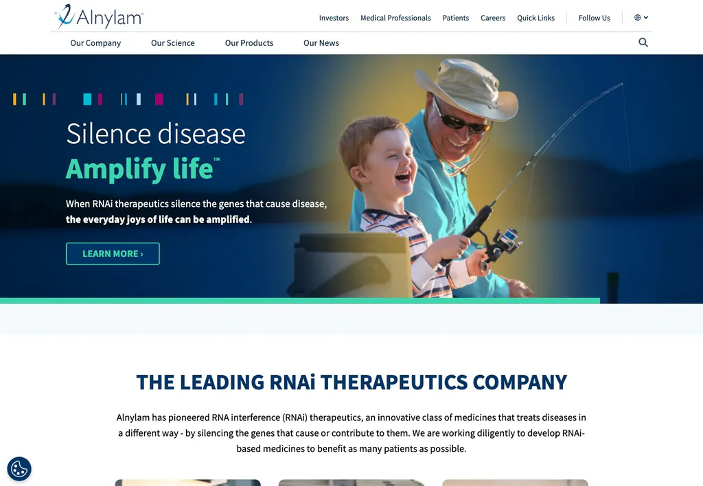
Alnylam pioneered RNA interference therapeutics, and its website leads with people rather than mechanism. The hero pairs the tagline “Silence disease. Amplify life.” with everyday moments like a grandfather fishing with his grandson, then hands visitors a clear path into the science.
Named patients living with amyloidosis, porphyria, and primary hyperoxaluria speak in their own words, each linked to a deeper condition page. Dedicated tracks for patients, medical professionals, and investors keep every audience one click from content written for them.
Biotech organizations often overcorrect in one direction. They either simplify until the science disappears or publish expert-level content with no human context. Alnylam shows the two can coexist at commercial scale.
What to borrow: Lead with human outcomes, let named patient voices carry the credibility, and keep role-based paths into the science one click away.
14. Merida Biosciences
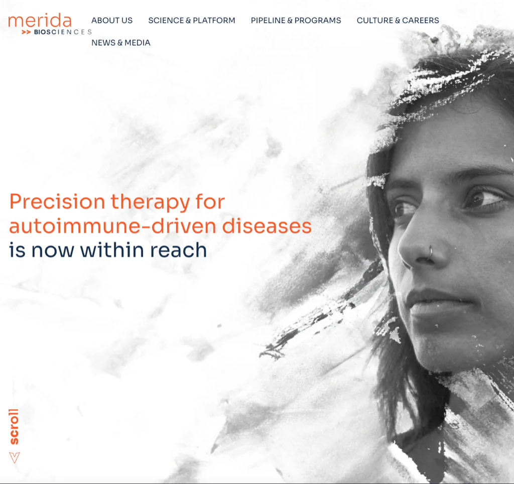
Merida’s site is a useful example for an early-stage company that needs focus more than volume. It presents a clear direction around precision therapy for autoimmune-driven disease and avoids filling the site with generic pages simply to appear larger.
A concise website can be credible when its few pages answer the right questions. It becomes vague when it substitutes ambition for mechanism, leadership, and development context.
What to borrow: Build the smallest site that fully explains the current company. Create a structure that can expand as programs, publications, partnerships, and recruiting needs grow.
15. Apollo Therapeutics
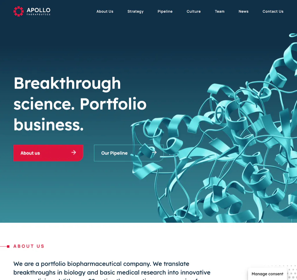
Apollo has to explain both science and a portfolio business model. Its website gives visitors paths into the portfolio, partnerships, company story, and team rather than presenting a conventional single-platform narrative.
That is important because potential partners are evaluating more than molecules. They are evaluating how opportunities enter the organization, how programs are advanced, and what the relationship could look like.
What to borrow: If the operating model is a differentiator, explain it visually and in plain language. Do not force visitors to infer the business model from a list of programs and investor announcements.
16. Phathom Pharmaceuticals
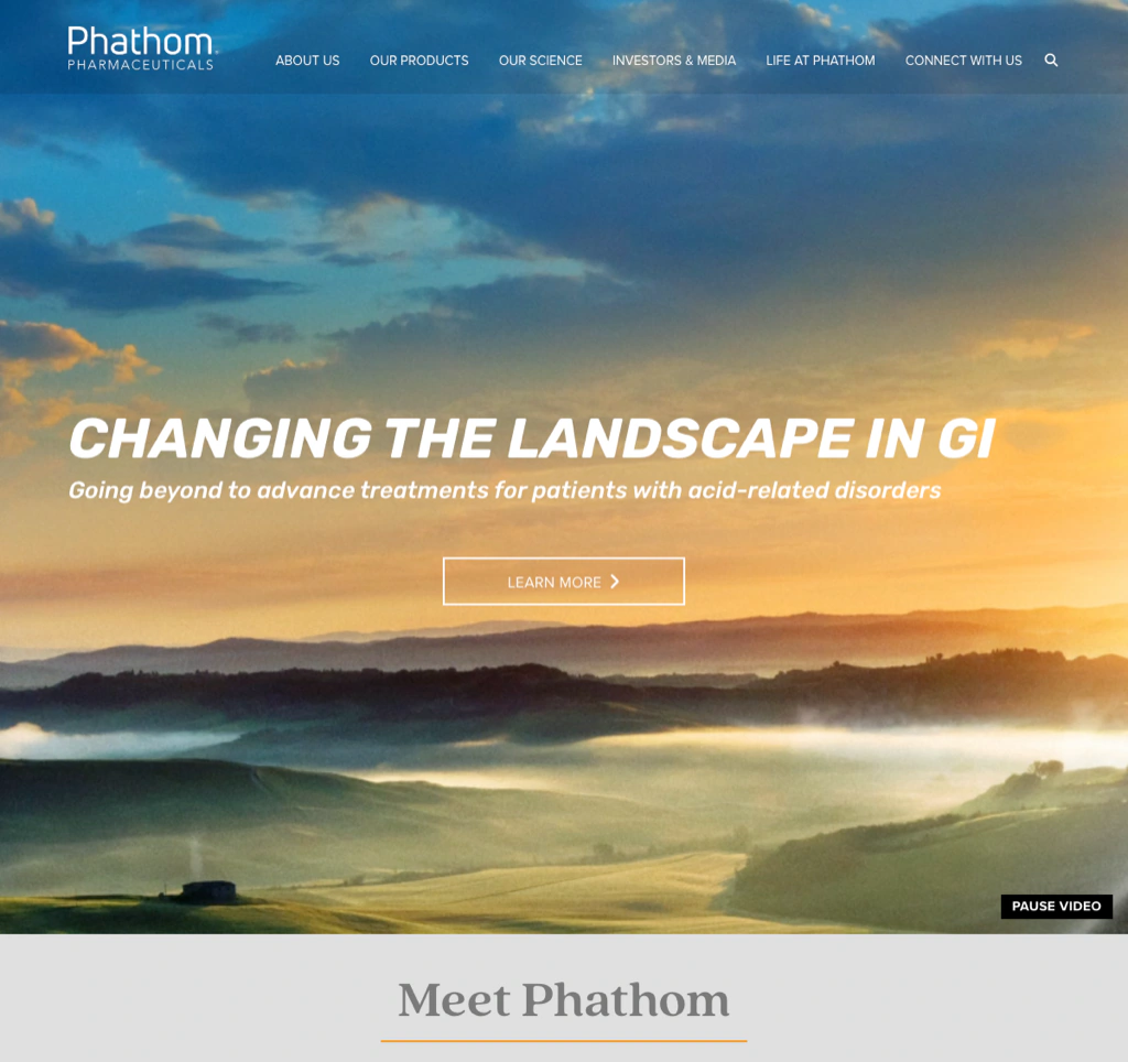
Phathom serves several high-stakes audiences, including patients, healthcare professionals, investors, and people seeking medical information. The site separates those journeys and makes regulatory and product context easier to find.
Commercial-stage pharmaceutical websites have different obligations from early discovery companies. Product information, medical resources, safety language, corporate content, and investor material need clear boundaries and governance.
What to borrow: Use audience gateways and persistent utility navigation for medical information, products, investors, and contact options. Do not bury regulated or high-value content inside a marketing menu.
17. Minerva Neurosciences
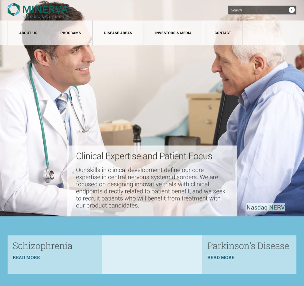
Minerva organizes its central nervous system programs, disease-area information, publications, company information, and investor resources in a straightforward corporate structure. The site shows that clarity and credibility do not require an experimental interface.
For public and clinical-stage companies, predictable navigation can be a strength. Investors and scientific reviewers often arrive with a specific task and should not have to learn a novel interaction model first.
What to borrow: Make programs, publications, SEC or investor information, and contact details available through familiar labels and stable URLs.
Product Discovery, Resources, and Conversion
18. CELLTREAT Scientific Products
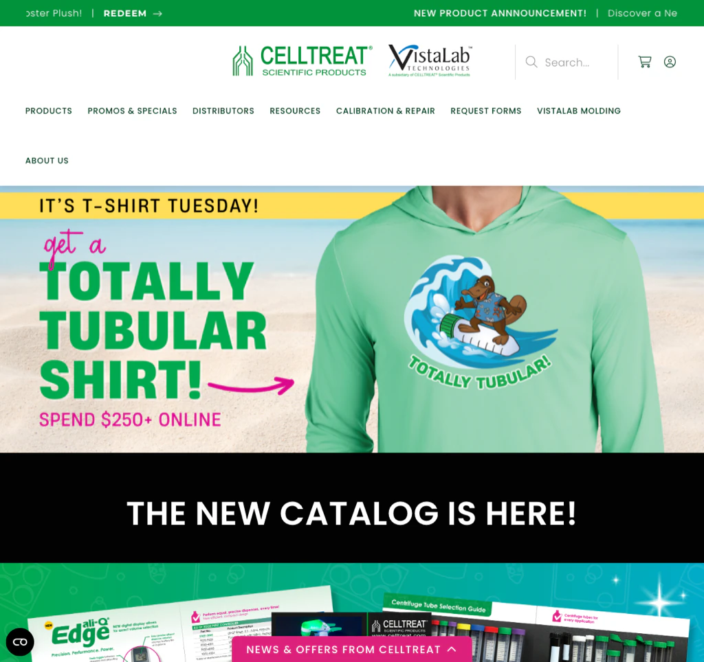
Visit CELLTREAT Scientific Products
CELLTREAT pairs a playful visual identity with serious product-discovery tools. Its navigation and search help laboratory buyers reach categories and products, while resources and support content help the company function as more than a catalog.
This is a useful reminder that “biotech website” does not always mean a therapeutic pipeline. Life-science product and tools companies need information architecture built around applications, specifications, documentation, availability, and purchasing tasks.
What to borrow: Brand personality should not compete with product findability. Prioritize search, filters, category structure, technical downloads, and a clear path to support or purchase.
19. LuminUltra
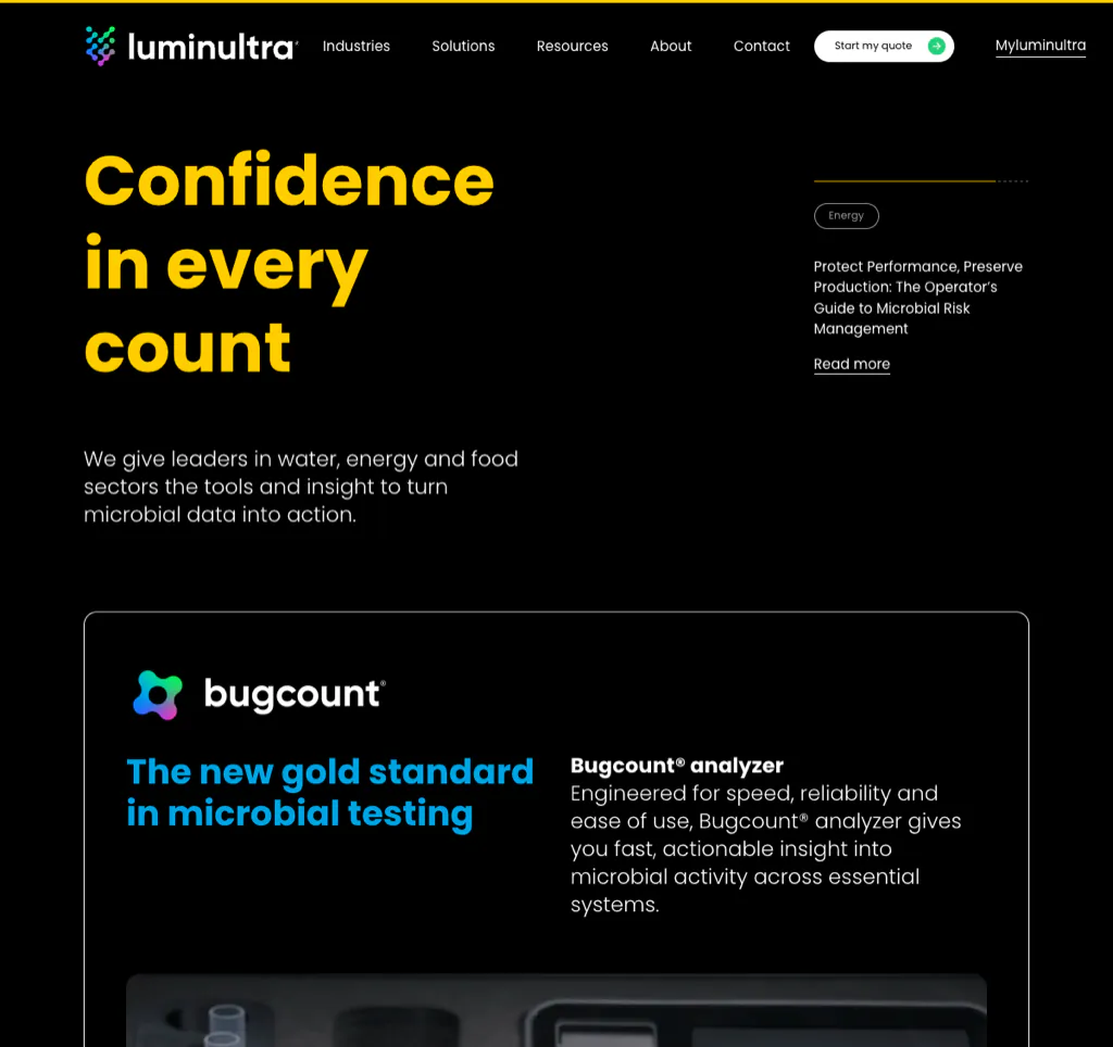
LuminUltra helps technical buyers navigate through industries, solutions, resources, and contact paths. Rather than expecting every visitor to understand the company’s full testing portfolio, the site creates routes based on problems and applications.
That structure supports both discovery and conversion. A buyer may search for a specific microbial-monitoring problem before knowing the relevant product name.
What to borrow: Organize complex technical offerings around the language buyers use—their industry, application, problem, or desired outcome—while preserving product-level detail for expert evaluation.
20. MatTek Life Sciences
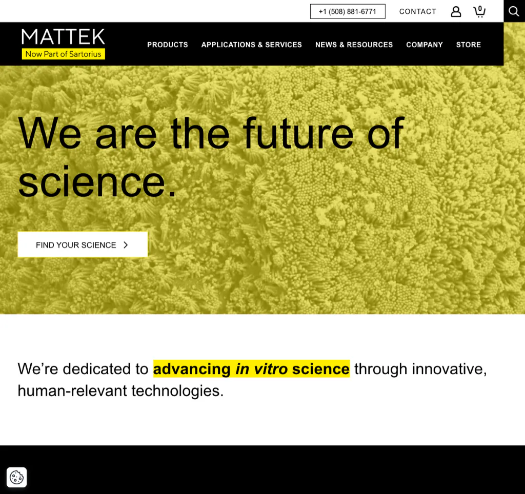
MatTek, part of Sartorius, has a broad set of tissue models, cells, media, and related resources. Its website relies on category-led navigation and product paths to keep that breadth manageable.
Scientific catalogs become difficult when the corporate hierarchy, product taxonomy, applications, and resources all compete in the same navigation. A good architecture treats those as related but distinct ways to enter the catalog.
What to borrow: Validate product taxonomy with actual users. Use consistent category names, strong on-site search, technical documentation, and cross-links among products, applications, and protocols.
21. OpenClinica
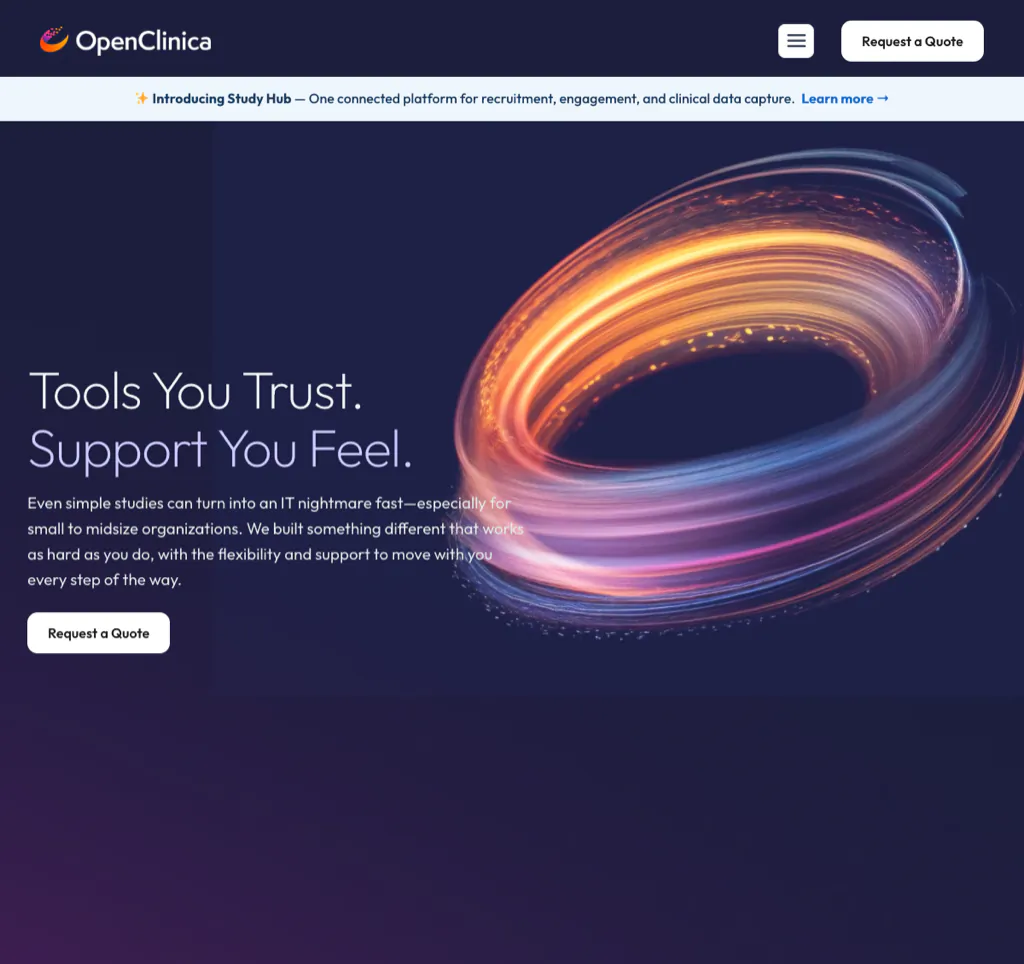
OpenClinica serves biotech and pharmaceutical companies, CROs, academic institutions, and public-sector organizations running clinical research. Its site uses role- and solution-based pathways, educational resources, product information, and persistent calls to action to move visitors from a problem to an appropriate next step.
3 Media Web rebuilt the site on WordPress to replace an unclear, siloed structure with pathways for clinical operations teams, data managers, and sponsors. Following the redesign, OpenClinica reported a 23% increase in web traffic and a 92% increase in backlinks. The new system also allowed the marketing team to launch campaigns and update pages without depending on developers for every change.
What to borrow: A website should improve both the visitor experience and the marketing team’s ability to operate it. Role-based architecture and a flexible CMS can create value long after launch.
22. Asimov
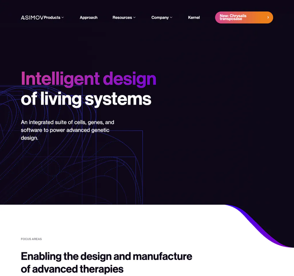
Asimov presents an integrated suite spanning cells, genetic design, process, and software-supported biomanufacturing. Its challenge is architectural: users need to understand the whole system while also identifying the specific product, service, or engagement model relevant to them.
The site addresses this with structured focus areas, product paths, and clear ways to work with the company. That is more useful than forcing every visitor through a single generalized platform description.
What to borrow: For an integrated platform, show the system first, then let users enter through their problem, product need, or preferred working relationship.
23. Hexagon Bio
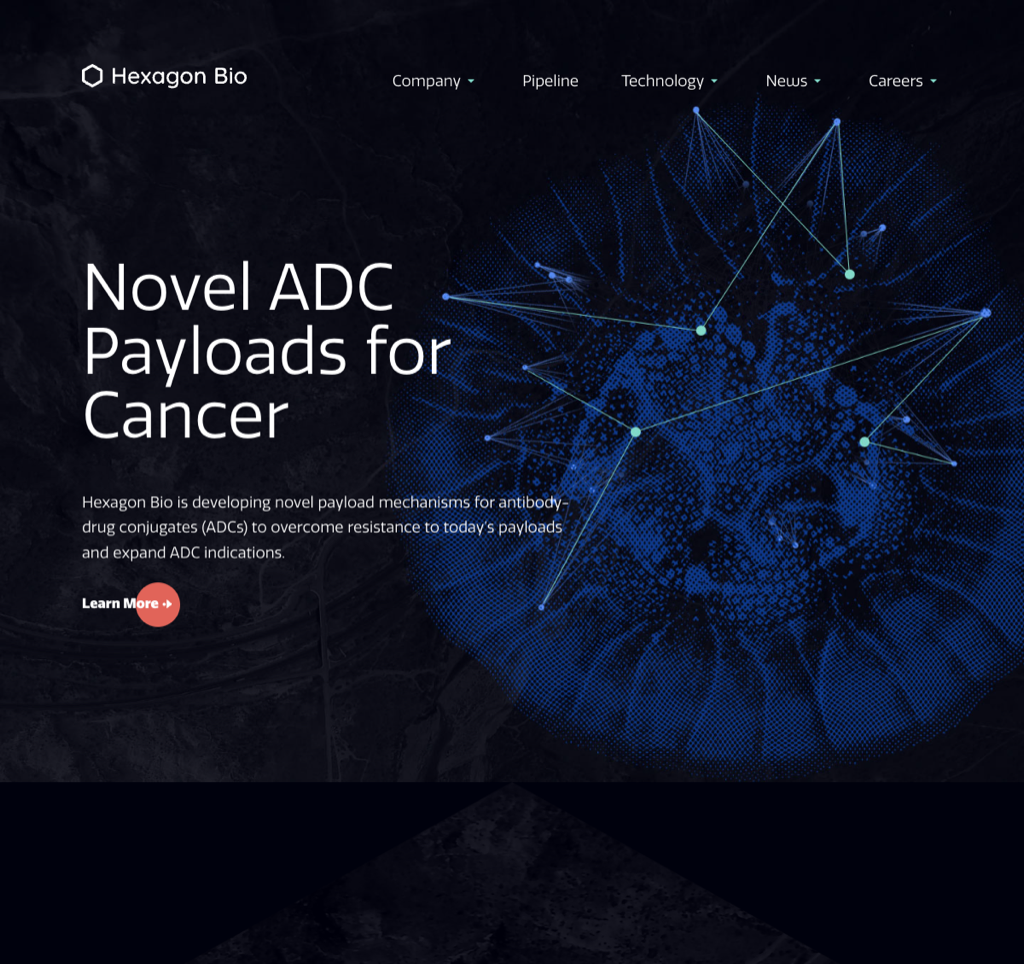
Hexagon Bio shows the power of concise positioning. “Novel ADC Payloads for Cancer” tells a relevant visitor what the company is building and where it applies. The technology and pipeline pages then provide the scientific depth that the homepage appropriately withholds.
Concise is not the same as vague. The strongest short biotech homepages are specific about modality, problem, or program and provide obvious routes to the evidence.
What to borrow: Remove broad claims until the first screen answers three questions: What are you building? For what problem or audience? Where can I examine the science?
What Makes Biotech Web Design Effective?
The examples above look different because they serve different organizations and audiences. The underlying requirements are more consistent.
1. A direct value proposition
The homepage should state what the organization does in language a relevant visitor can understand. Scientific accuracy does not require opening with internal platform terminology.
2. Layered scientific storytelling
Start with the problem and core approach, then let readers move into mechanism, platform, programs, publications, and source material. This serves both general business readers and specialists.
3. Audience-specific navigation
Researchers, investors, partners, patients, healthcare professionals, buyers, and candidates do not enter with the same task. Give high-priority audiences distinct paths where their needs materially differ.
4. Clear pipeline and program information
Use consistent stages, labels, indications, status language, and legends. A pipeline graphic should remain readable on mobile and should not contain essential information only inside an image.
5. Evidence and trust signals
Make leadership, scientific advisors, publications, posters, trials, partners, product documentation, quality information, and relevant disclaimers easy to find. Avoid logo walls without context.
6. Accessible, responsive experience
Accessibility is part of scientific and commercial credibility. Follow current WCAG guidance, use semantic HTML, make interactions work by keyboard, provide useful alternative text, maintain contrast, and test complex diagrams on small screens. 3 Media Web builds accessible web design into every biotech project rather than treating it as a post-launch fix.
7. Fast, stable performance
Large hero video, WebGL effects, and unoptimized scientific animation can undermine the experience they are meant to improve. Monitor Core Web Vitals and use motion only when it adds explanatory value.
8. A secure and maintainable platform
A biotech site should receive proactive software updates, backups, monitoring, access control, and vendor review. Marketing teams also need flexible components and publishing workflows so the site does not become outdated between redesigns. That kind of flexibility usually comes from custom WordPress development built around the company’s actual content and review workflows, not a generic template.
9. Search and AI-discovery readiness
Important content should be crawlable, indexable, written in clear HTML, connected through internal links, and supported by accurate titles, headings, schema, and source information. Generic AI-generated articles will not create the same authority as expert-led scientific content, original data, and documented experience.
10. Meaningful conversion and measurement
Calls to action should reflect the audience and business model: request a demo, discuss a partnership, find a distributor, access medical information, view trial information, download a technical resource, or contact investor relations. Track whether those actions lead to qualified outcomes. Ongoing conversion rate optimization turns that tracking into a repeatable improvement process rather than a one-time launch checklist.
What Are the Best Features for Pharmaceutical and Biotech Websites?
The right feature set depends on the company’s stage and business model, but strong pharmaceutical and biotech websites commonly include:
- A mission-led homepage with a precise explanation of the company.
- Platform or science pages with layered technical depth.
- A mobile-readable pipeline or product architecture.
- Program, indication, or solution pages with consistent status language.
- Patient, healthcare-professional, investor, partner, or buyer pathways where relevant.
- Leadership, board, advisor, and governance information.
- Publications, posters, clinical-trial links, technical resources, or product documentation.
- News, events, and milestone content with an owner and review process.
- Accessible forms and audience-specific calls to action.
- A modular CMS that the marketing team can update safely.
- Website and CRM integrations, marketing automation, analytics, and consent management.
- Secure hosting, monitoring, backups, and proactive maintenance.
- Search-friendly HTML, metadata, internal links, schema, and page performance.
Do not add features merely because competitors have them. Every component should support a real audience task, business goal, or operational need.
How Do Life-Science Companies Attract More Visitors to Their Websites?
A redesigned site will not create sustained qualified traffic by itself. Life-science companies attract more relevant visitors by connecting technical SEO, expert-led content, authority building, promotion, and conversion measurement.
Map search demand to the right page types
Create pages for the problems, technologies, applications, indications, products, industries, and audience questions the company can address with real expertise. Avoid forcing every keyword into the homepage.
Publish content experts can stand behind
Use subject-matter experts to create or review platform explanations, educational resources, data interpretations, technical guides, case studies, and point-of-view content. Name authors and reviewers where appropriate.
Build a sound technical foundation
Make important pages crawlable and indexable. Use descriptive titles, headings, canonical tags, internal links, sitemaps, structured data, and responsive templates. Monitor site speed and index coverage.
Earn credible references
Partnerships, publications, conferences, associations, universities, portfolio companies, distributors, and media coverage can create authoritative discovery paths and links. Do not reduce authority building to mass link outreach.
Keep the company story current
Update pipeline, product, publication, event, leadership, and milestone information. An outdated site gives both users and search systems less reason to trust it.
Promote content through the channels the audience uses
Organic search should work with email, LinkedIn, paid media, scientific communities, conferences, investor communications, sales outreach, and partner networks.
Measure qualified outcomes
Track discovery, engagement, resource use, form completion, partnership inquiries, demos, distributor leads, trial information visits, and pipeline influence where appropriate. Traffic without audience quality is not the goal.
For a deeper search strategy, see Biotech SEO: What to Do (and What to Avoid).
How Do You Improve SEO for a Biotech Website?
Improve biotech website SEO by making the science understandable and technically accessible—not by repeating broad keywords across every page.
Prioritize:
- A clear site architecture for platforms, programs, products, indications, solutions, resources, and audiences.
- Pages that answer specific search needs with expert-reviewed content.
- Descriptive title tags, headings, internal links, and metadata.
- Crawlable HTML versions of important information that would otherwise live only in PDFs, videos, or diagrams.
- Fast, mobile-friendly templates and clean technical implementation.
- Accurate structured data where it matches visible page content.
- Credible links and mentions earned through research, partners, media, events, and useful resources.
- Measurement in Google Search Console, analytics, and the CRM.
A specialist page should not be simplified until it becomes generic. The goal is to create a clear entry point and then provide the depth scientific readers expect.
How Do You Improve Website Security for Biotech Companies?
Website security should be treated as an operating process, not a launch checklist.
A practical baseline includes:
- Managed hosting appropriate to the site’s traffic and risk.
- HTTPS across the site.
- Prompt WordPress core, theme, and plugin updates.
- Least-privilege user access.
- Multifactor authentication for administrators.
- Strong password and account-lifecycle policies.
- A content delivery network and web application firewall where appropriate.
- Automated backups with tested restoration procedures.
- Uptime, malware, and vulnerability monitoring.
- Review of third-party scripts, forms, plugins, and integrations.
- Staging and quality assurance before production changes.
- An incident-response and escalation process.
- Collection of only the form data the business actually needs.
The OWASP Top 10 is a useful awareness framework, but it is not a security audit.
Do not assume every biotech marketing website is subject to the same privacy or healthcare regulations. Requirements depend on the company, geography, data collected, users, integrations, and purpose. Legal, security, and compliance teams should review relevant obligations.
3 Media Web provides ongoing website support and security updates for organizations that need a proactive technical partner after launch.
Common Biotech Digital-Strategy Errors—and How to Fix Them
| Error | Why it fails | Better approach |
|---|---|---|
| One generic homepage tries to serve every audience | Scientists, investors, patients, partners, and buyers cannot quickly find their path | Prioritize audiences and create distinct routes where needs differ |
| The science is either vague or impenetrable | General readers cannot understand the company, or experts cannot find evidence | Use layered content from plain-language overview to technical depth |
| SEO is treated as a launch task | Rankings and demand change while content becomes stale | Run an ongoing technical, content, authority, and measurement program |
| Motion is prioritized over accessibility and speed | The page looks impressive but becomes harder to use | Use animation to explain, respect reduced-motion preferences, and test performance |
| The pipeline exists only as an image | It becomes difficult to read on mobile and inaccessible to search or assistive technology | Pair the visual with structured HTML and consistent program pages |
| Calls to action are generic | “Learn more” and “Contact us” do not reflect user intent | Use audience- and task-specific actions |
| The site has no content governance | Pipeline, leadership, publication, and event pages become outdated | Assign owners, review dates, workflows, and approval rules |
| The CMS requires a developer for routine changes | Marketing cannot respond to milestones or campaigns | Use flexible, controlled components and clear editing permissions |
| Security and compliance claims are vague | Broad claims can create risk and reduce credibility | Describe real controls and route formal claims through legal and security review |
| Measurement stops at pageviews | The team cannot connect the site to business outcomes | Track qualified actions and connect analytics with CRM data |
Does Your Biotech Website Need a Redesign or a Refresh?
Choose a full redesign or rebuild when:
- The current site no longer represents the company, science, pipeline, or business model.
- Navigation cannot support priority audiences.
- Important content is trapped in PDFs or hard-coded templates.
- The site has major accessibility, performance, or technical debt.
- Marketing cannot make routine updates safely.
- The CMS, hosting, integrations, or component system cannot support growth.
- A merger, rebrand, financing stage, product launch, or strategic shift has fundamentally changed the story.
Choose a targeted refresh when:
- The information architecture remains sound.
- Core templates are accessible and maintainable.
- The main gaps are messaging, visual identity, a few page types, or conversion paths.
- Performance and technical SEO can be improved without replacing the platform.
Choose continuous optimization when:
- The site is structurally healthy.
- The organization has reliable analytics and CRM data.
- The team can publish and test improvements regularly.
- The priority is better conversion, content performance, and user experience rather than a new foundation.
There is no universal redesign schedule. Review the website when the science, audience, business model, technology, or performance data shows that the current experience is creating friction.
For the organizational side of this decision, see how CMOs handle a website overhaul without losing momentum.
Frequently Asked Questions
What makes a biotech website effective?
An effective biotech website explains the company clearly, layers complex science, creates relevant audience paths, and shows credible evidence. It also works on mobile and with assistive technology, loads reliably, and gives visitors a meaningful next step. It must also be maintainable as programs, products, leadership, and milestones change.
What are the best biotech website designs?
The best design depends on the company’s stage and audience. Generate:Biomedicines is strong at platform positioning; Mammoth Biosciences at capability routing; Bicara at mission and program urgency; and Phathom at multi-audience navigation. CELLTREAT and LuminUltra stand out at product or solution discovery, and OpenClinica at role-based conversion. The useful question is not which site looks best, but which solves a problem similar to yours.
Should a biotech website use custom scientific illustrations?
Often, yes. Custom diagrams and illustrations can explain mechanisms, platforms, workflows, and pipelines better than stock imagery. They should remain accurate, readable on mobile, available with text alternatives, and easy to update as the science changes.
How do you improve SEO for a biotech website?
Build a clear architecture, publish expert-reviewed content for specific search needs, and make important information available in crawlable HTML. Then improve page performance, use descriptive metadata and internal links, earn credible references, and measure qualified outcomes. See 3 Media Web’s full biotech SEO guide for a deeper framework.
How do you improve website security for a biotech company?
Use managed hosting, HTTPS, prompt software updates, least-privilege access, multifactor authentication, backups, monitoring, staging, vendor review, and an incident-response process. Collect only the data needed and have legal and security professionals assess obligations based on the site’s actual use.
What makes a biotech domain name memorable?
A memorable biotech domain is short enough to recall, easy to pronounce and spell, distinctive, legally defensible, and flexible enough to survive pipeline or strategy changes. Avoid unnecessary hyphens, obscure abbreviations, confusing spelling, and forced keyword phrases. A domain is primarily a brand and risk decision—not an SEO shortcut.
How much does a biotech website redesign cost?
There is no responsible universal price. Scope depends on content strategy, scientific illustration, accessibility requirements, templates, CMS architecture, integrations, migration, SEO preservation, security, validation, stakeholder review, and post-launch support. Compare proposals against the required outcomes and operating model, not only the page count.
Build a Biotech Website That Can Keep Up With the Science
A biotech website should not be a static design artifact. It should help the organization explain complex work, earn trust, support discovery, convert the right audiences, and publish quickly as the company changes.
3 Media Web designs, develops, and supports WordPress websites for biotech and life-science organizations. Our work can include strategy, information architecture, custom design, scientific content structure, accessible development, SEO, integrations, analytics, conversion optimization, hosting, and ongoing support.
Our OpenClinica work shows what that combination can achieve: clearer role-based journeys, more control for the marketing team, a 23% increase in web traffic, and a 92% increase in backlinks.
For a closer look at how we keep redesigns consistent and conversion-focused, see our explainer on our design toolkit versus page-layout approach.
Explore our biotech web design approach or start a conversation about your website.
See how this fits the bigger picture in our biotech web design overview — how we design, build, and support sites for life-science marketing teams.