Last updated: July 14, 2026
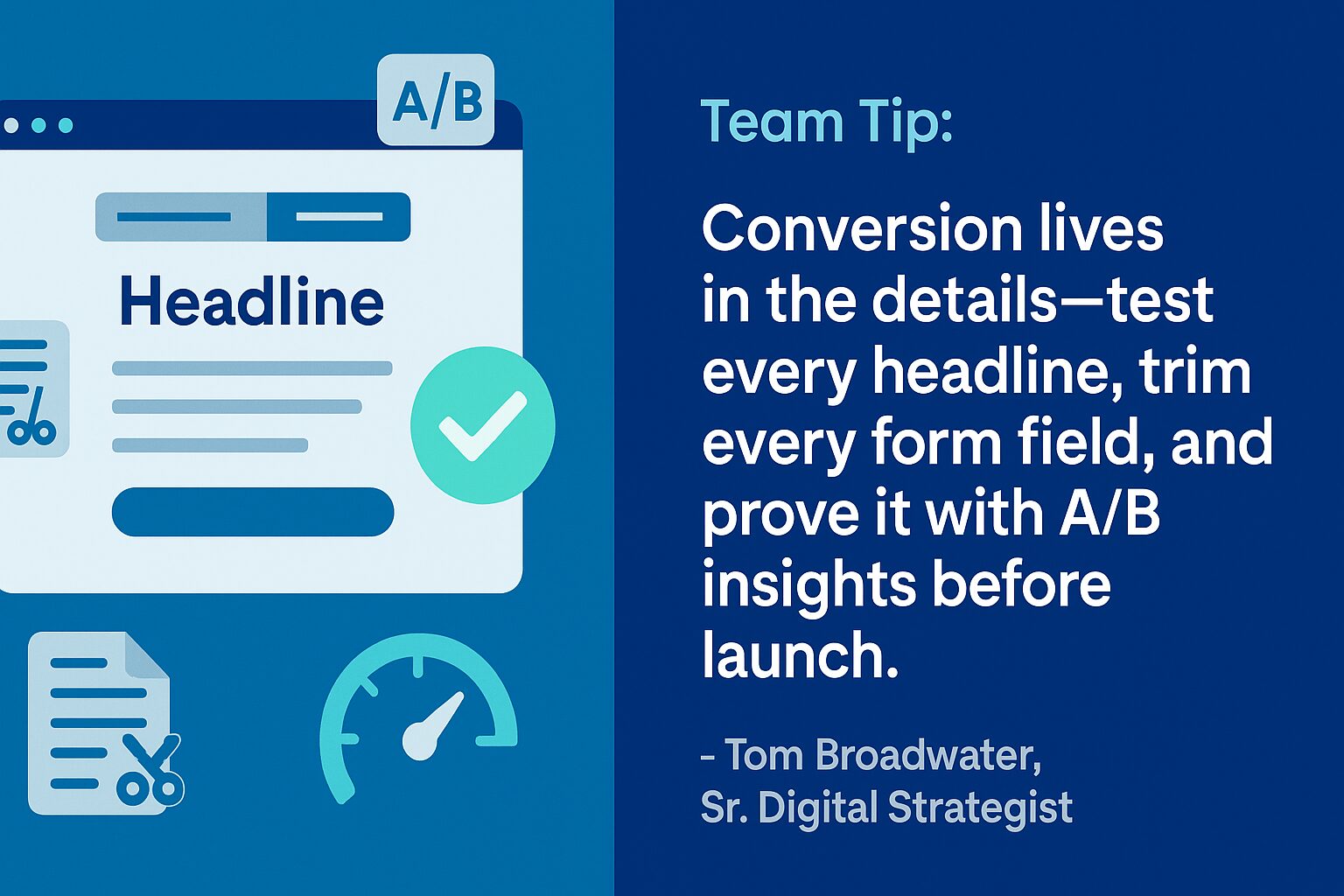
- Lead with a clear, outcome-focused headline. It should answer “what’s in it for me?” in plain, benefit-driven language that names your audience’s pain point.
- Keep it focused: one CTA, one goal. Remove distractions, repeat a single visually distinct button, and use specific copy like “Get the Guide” or “Request a Demo.”
- Make forms short, smart, and tested. Limit forms to 3-5 essential fields, use progressive profiling, and test every form yourself, because a broken form is a silent conversion killer.
- Support it with copy that converts: structure your message as Problem → Solution → Value → Proof, and back it with testimonials, stats, or client logos.
- Design for speed and mobile. Fast, mobile-friendly pages convert more; a two-second delay alone can cost roughly 4% of revenue per visitor, so compress images and test on every device.
What makes a landing page actually convert?
A landing page converts when one focused message, one clear call to action, and a fast, frictionless experience all point the visitor toward a single next step. The pages that fail almost always break one of those rules: too many choices, a vague headline, a bloated form, or a layout that loads slowly on a phone.
You launched the campaign, shared the ads, promoted the asset, and waited. But the results were disappointing. Traffic trickled in, bounce rates stayed high, and the form submissions never materialized. For many marketing managers, especially in B2B manufacturing, that story is all too familiar. The page looked clean and on-brand, but it did not convert, and with limited resources and high expectations, you cannot keep launching pages that underperform.
The good news: high-converting landing pages are not a mystery. With the right structure, content, and strategy, you can build pages that reliably move visitors to act. This guide walks through the building blocks, gives you a checklist to audit any page, and shows where a strong conversion rate optimization program turns a one-time fix into ongoing gains.
Want a second set of eyes on a page that is not converting? Our team can audit it with you.
Why do landing pages matter more than ever?
Landing pages are where campaigns either succeed or stall. Whether you are promoting a gated whitepaper, a demo request, or a product showcase, the page has one job: converting interest into action.
Related reading: Conversion Testing: How to Benchmark and Improve Your Website.
When buying cycles are long and decisions are complex, as they are in manufacturing, landing pages have to do even more. They need to educate, reassure, and guide visitors quickly and clearly, often to several stakeholders who each scrutinize the page before anyone fills out a form.
We unpack this further in Dynamic Landing Pages for PPC: Why They Win More Conversions.
What is landing page conversion rate optimization?
Landing page conversion rate optimization (CRO) is the practice of increasing the share of visitors who complete your goal, such as a form fill or demo request, by testing and improving one element at a time. Instead of redesigning everything at once, you adjust the headline, CTA, form, or proof, measure the change, and keep what works. Small, disciplined improvements compound into meaningful lifts.
What are the building blocks of a high-converting landing page?
Before diving into design details, get the fundamentals right. Six elements do most of the heavy lifting on any landing page that converts.
1. A clear, benefit-driven headline
The headline is the first thing a visitor sees, so it must immediately communicate what the offer is and why it matters.
- Use action-oriented language.
- Focus on outcomes, not features.
- Avoid jargon or overly broad claims.
Example: “Download the Guide to Reducing Production Downtime by 20%.”
2. One focused call to action
Too many choices create confusion. A strong landing page has a single, clear CTA, usually a button or a short form.
- Place the CTA above the fold and repeat it farther down the page.
- Use specific language like “Get the Guide” or “Request a Demo.”
- Make sure the CTA stands out visually.
3. A short, smart form
Long forms kill conversions, especially in manufacturing, where trust builds slowly. Ask only for the information you truly need at this stage.
- Keep it to 3-5 fields max (for example: Name, Email, Company, Role).
- Consider progressive profiling if you use a tool like HubSpot.
- Always test the form yourself; a broken form is a silent conversion killer.
4. Persuasive copy that speaks to the buyer
The copy should connect to real pain points and show how your solution addresses them. Structure your message in this order:
- Problem: call out what your visitor is struggling with.
- Solution: introduce your offer as the answer.
- Value: highlight what they gain by converting.
- Proof: add trust signals like stats or testimonials.
Keep the language clear, confident, and tailored to your audience, not overly technical, unless you are speaking directly to engineers or technical buyers.
5. Trust builders and proof points
B2B buyers, especially in manufacturing, need to validate their decision. Help them say yes with supporting proof:
- Client logos.
- Case study snippets or testimonials.
- Data points or certifications.
- Awards or press mentions.
Even a short customer quote can dramatically improve credibility.
6. A mobile-friendly, fast-loading experience
Page speed and usability directly affect conversion rates. A beautiful page that loads slowly or breaks on mobile is not doing its job. According to Cloudflare’s web performance research, a two-second delay in page rendering led to about a 4% loss in revenue per visitor, so speed is not a nice-to-have. Make sure:
- Images are compressed.
- Layouts are responsive.
- CTA buttons are easy to tap.
- Page speed scores are healthy across devices.
This is where strong website support and development practices play a key role.
What this looks like in practice
In our work with EZTube, a manufacturer with strong organic rankings but weak sales, the pages were pulling traffic yet converting poorly. Working within an ultra-tight budget, we rewrote headings around higher-intent keywords, added and repositioned clear calls to action, optimized metadata, and simplified content blocks so the most important information stood out. The result: a 95% year-over-year increase in ecommerce purchases, an 11% lift in key conversion events, and a 17% jump in total users, all from optimizing existing pages rather than buying more traffic. It is a clear reminder that most underperforming pages do not need more visitors; they need fewer distractions and a sharper path to action.
Landing page conversion checklist
Use this table to audit any landing page before it goes live. For each element, confirm what good looks like and why it moves the conversion needle. Whichever row is weakest on your page is the best place to start.
| Element | What good looks like | Why it converts |
|---|---|---|
| Headline | Outcome-focused, jargon-free, names the visitor’s pain point. | Answers “what’s in it for me?” in the first three seconds. |
| Call to action | One CTA, repeated, visually distinct, with specific copy. | Removes choice paralysis and points to a single next step. |
| Form | 3-5 essential fields, tested, with progressive profiling. | Less friction and fewer abandons, especially on mobile. |
| Copy | Problem, solution, value, then proof, in plain language. | Connects to real pain and earns the click without jargon. |
| Proof | Logos, testimonials, data points, certifications, awards. | Validates the decision for cautious B2B buyers. |
| Speed and mobile | Compressed images, responsive layout, tap-friendly buttons. | Slow or broken pages lose visitors before they convert. |
When should you build a dedicated landing page instead of using an existing page?
Build a dedicated landing page whenever you are driving paid or campaign traffic to a single offer, such as a demo, a gated guide, or an event. A focused page with one message and one CTA almost always outperforms sending that traffic to a busy homepage or service page. Use an existing page only for broad, ongoing organic visibility where visitors expect to explore.
How do you optimize a landing page once the basics are in place?
Once the fundamentals are solid, a few habits take your pages from good to consistently high-performing.
Optimize with A/B testing
Test one variable at a time so you can tell what actually moved the result:
- Headlines.
- Button copy or color.
- Images or hero sections.
- Form placement.
Changing one element per test keeps your data clean. This disciplined testing is a core pillar of conversion rate optimization, where small, measured changes compound over time. If you are running these tests with a lean team, our guide on how to prioritize website tasks when you’re a team of one or two can help you decide what to tackle first.
Align with campaign sources
If your landing page is tied to paid media management, make sure the message matches the ad copy. That consistency, sometimes called message match, improves trust and follow-through. And do not forget tracking URLs (UTMs) so you can segment performance by source.
Keep SEO in mind
Even a campaign-specific landing page benefits from SEO. Well-structured pages with optimized headings, image alt text, and internal links can increase discoverability and keep delivering value long after the campaign ends.
How can 3 Media Web help?
At 3 Media Web, we help manufacturing marketers build, test, and optimize landing pages that actually convert. We support your team with:
- Custom web design and development tailored to your brand and audience.
- Strategic input on copy, structure, and form UX.
- Conversion optimization based on real-time analytics and heatmaps.
- A/B testing setup and campaign-specific page variations.
- Ongoing strategic support to keep your pages fast, functional, and accessible.
Whether you need one page or a full library of templates, we will help you turn more clicks into real results. For more on what makes a web partnership work, see how partners can simplify complex client needs.
Frequently asked questions
What is a good conversion rate for a landing page?
There is no single benchmark, because it depends on your industry, traffic source, and offer. Instead of chasing an average, measure your own baseline, then improve it through better headlines, shorter forms, faster load times, and ongoing A/B testing. A page tied to high-intent paid traffic should convert better than one fed by cold, broad traffic, so always compare like for like.
How many fields should a landing page form have?
Keep it to three to five essential fields, such as name, email, company, and role. Every extra field adds friction and gives a cautious B2B buyer another reason to abandon. If you need more information over time, use progressive profiling so returning visitors are asked new questions instead of repeating what they already shared.
What is message match on a landing page?
Message match is the alignment between the ad or link a visitor clicked and the landing page they arrive on. When the headline, offer, and visuals echo the ad’s promise, visitors feel reassured they are in the right place and are far more likely to convert. A mismatch, such as an ad promising a discount and a page that never mentions it, breaks trust and drives quick bounces.
How does page speed affect landing page conversions?
Speed has a direct, measurable effect. According to Cloudflare’s web performance research, a two-second delay in page rendering led to roughly a 4% loss in revenue per visitor, and slower pages consistently see higher bounce rates. Compress images, use responsive layouts, and test load times on real devices so a fast experience is reinforcing your message rather than undermining it.
Should a landing page have navigation and multiple links?
Usually not. The most effective landing pages remove the main navigation and competing links so the visitor has one clear path: your call to action. Every additional link is a chance for someone to wander off before converting. Save the broader site exploration for your homepage and service pages, and keep the landing page focused on a single goal.
What is the difference between a landing page and a regular web page?
A landing page is built around a single conversion goal tied to a specific campaign or offer, while a regular web page, like a homepage or service page, serves many goals and audiences at once. That focus is exactly why landing pages convert better for campaigns: one message, one audience, and one action, with nothing competing for attention.
Turn more clicks into leads
High-converting landing pages come down to focus: one clear headline, one call to action, a short form, persuasive proof, and a fast experience on every device. Audit your next page against the checklist above, fix the weakest element first, and when you are ready to turn that audit into measurable results, reach out to our team to see how we can help.