Last updated: July 8, 2026
- A successful education website is easy to navigate, fast, accurate, mobile-friendly, accessible, and engaging for the specific audience it serves.
- The most common failures are confusing navigation, outdated or missing information, slow load times, and walls of text with no visuals.
- Plan information architecture, content ownership, and accessibility before a single page is built, not after launch.
- Page speed is non-negotiable: according to Think with Google, the probability of a mobile visitor bouncing rises sharply as load time climbs from one second toward ten.
- Use the DIY-vs-agency checklist below to decide whether to build in-house or partner with a web design team.
What makes an education website successful?
A successful education website lets every visitor find what they came for in as few clicks as possible, on any device, without hitting outdated information or a slow page. Whether the audience is prospective students, current families, faculty recruits, or donors, the site has to answer their question fast and look credible doing it. Everything else, from visual polish to blog content, supports that single job.
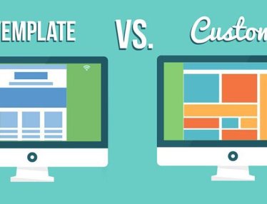
When you set out to build a website for a private or public institution, you have two paths: hire an experienced web design team or do it yourself with templates and off-the-shelf tools. The DIY route is possible, but it is a long road that often ends in a site that underperforms. Education websites are not all created equal, and the gap usually traces back to a handful of avoidable mistakes. Below are the flaws that sink most education sites, the steps that prevent them, and a clear way to decide who should build it.

What are the most common flaws in education websites?
The most common flaws in education websites are confusing navigation, inaccurate or missing information, too much text with too few visuals, and slow performance. Each one quietly pushes visitors away before they convert into an application, an inquiry, or a donation. Fixing them starts with naming them.
Confusing navigation
Confusing navigation is the fastest way to lose a visitor, and it hits comprehensive education sites hardest because they hold so much content. The site should flow smoothly from page to page and minimize the clicks between a visitor and the information they want. If people cannot find what they are looking for, most will simply leave. A few navigation best practices keep that from happening:
- Be descriptive. Visitors should never have to guess where a link leads. Keep menu labels short, concrete, and free of clever wording.
- Create a path forward. Guide visitors with related links and suggested next steps inside your on-page content, not just the main menu.
- Include a search bar. Site search lets visitors jump straight to a course catalog, a tuition page, or a contact form without hunting through menus.
Inaccurate or missing information
Outdated information is one of the most damaging problems an education website can have, because it breaks trust at the exact moment a family or applicant is making a decision. Anticipate what each audience needs, then make sure that content is correct, complete, and current. Staff and faculty pages need to reflect new hires and departures, and curricula, schedules, and hours have to stay up to date. A website is never finished at launch; plan for ongoing updates from day one by deciding who owns each section.
Too much text, not enough visuals
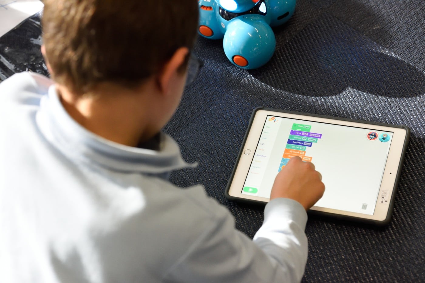
Walls of text drive readers off, especially when the audience includes younger students and busy parents. Educational institutions are judged on how well they engage and inform, and authentic photos of real campus life do that faster than paragraphs ever will. Strike a deliberate balance between written and visual content, and choose images that reflect your institution’s values so the site builds trust through transparency rather than stock-photo gloss.
Slow, bloated pages
A slow page is a silent conversion killer. According to Think with Google’s mobile page speed benchmarks, as a mobile page’s load time goes from one second to ten seconds, the probability of a visitor bouncing increases 123%. Aim to load your most important pages in roughly three seconds or less. The fastest wins are usually compressing images, trimming unnecessary plugins, and serving assets efficiently, all of which are core to solid website development.
What is information architecture for an education website?
Information architecture is the plan for how every page, menu, and label on your site is organized and connected so visitors reach what they need without guessing. For an education website, that means mapping the paths for each audience, prospective students, current families, faculty, and donors, before design starts. Get it right and the site scales for years; get it wrong and you inherit broken links and dead ends.
How do you build a successful education website, step by step?
Building a successful education website is a sequence of deliberate steps: study the competition, settle ownership and legal questions, plan the structure, optimize for speed, design for engagement, gather feedback, and make it work on mobile. Work through them in order and you avoid the rework that derails most projects.
Check out the competition
Start by studying what other institutions publish. A careful review of competing sites shows you what to match, what to beat, and which credible sites are worth linking to. Take notes on what works and where rivals fall short, then fold those findings into your own concept.
Know the legal stuff
Clarify ownership before construction begins. On a large educational site, you need to know who controls the domain, the hosting, and any copyright or intellectual-property tied to your content and platform. This is where an experienced web design or digital marketing partner pays for itself, because they handle these questions every day and keep them from becoming launch-day surprises.
Plan the information architecture
Plan the structure before you build a single page. Every time you rename a file or move a page after launch, you risk broken links and dead ends that erode the user experience. Careful planning up front lets the site grow without changing page addresses or breaking assets, which protects both usability and SEO. The strongest sites start from a deliberate custom web design plan rather than a template forced to fit.

Design for engagement, accessibility, and feedback
Content matters most, but appearance and inclusivity carry real weight. Use attractive images and clean layouts without slowing the page, and design to recognized education standards. Accessibility is not optional: the U.S. Department of Education and ADA guidance both expect education sites to work for visitors with disabilities, which makes website accessibility a baseline requirement rather than a finishing touch. In our work with the University of Pennsylvania’s School of Social Policy & Practice (SP2), a leading graduate school, we rebuilt a stagnant, hard-to-manage site into one that is mobile-responsive and ADA-conscious, with page-speed gains from WP Rocket and Pantheon; paired with digital marketing, that work helped drive a 62% conversion increase and 68 more applications year over year. Build in feedback channels too: ask for it directly, watch analytics for how pages perform, and run short user surveys to hear from the people actually using the site.
Make it work on mobile
Design for mobile first, because that is where most of your audience already is. Statcounter Global Stats data shows mobile devices account for the majority of web traffic worldwide, and Think with Google’s analysis confirms more than half of overall web traffic comes from mobile. Once a page looks right on desktop, test it on real phones across Chrome, Safari, and Firefox: check that fonts and formatting hold and that every link still works.
When should a school redesign its website instead of refreshing it?
Refresh when the structure still works and you only need updated visuals, copy, or a few pages. Redesign when navigation confuses visitors, the site fails on mobile or accessibility, information architecture blocks growth, or the platform slows your team down. A rule of thumb: if fixing the problems means rebuilding the way pages connect, you have outgrown a refresh and need a redesign.
Should you build the education website in-house or hire an agency?
Build in-house when the site is small, short-lived, and served by an existing team; hire an agency when the site is a long-term asset that has to attract students, recruit faculty, and drive donations. The decision comes down to the complexity of the site against the time, skills, and accountability you can commit internally. The checklist below compares both paths across the factors that decide whether an education website succeeds.
| Factor | DIY with templates and tools | Partner with a web design agency |
|---|---|---|
| Information architecture | Often constrained by a template’s fixed structure. | Planned around your audiences and built to scale without broken links. |
| Page speed | Easy to bloat with plugins and oversized images. | Optimized images, lean code, and a fast hosting setup from the start. |
| Accessibility & compliance | ADA and WCAG details are easy to miss without expertise. | Inclusive design and compliance built into the process. |
| Ongoing updates | Fall to whoever has time, so they often lapse. | Supported by a clear plan and a partner who maintains the site. |
| Timeline & accountability | Competes with everyone’s day job; no single owner. | Named owners, a defined process, and deadlines someone is accountable for. |
If you are weighing that build against a stretched internal team, it helps to first prioritize your website tasks when you are a team of one or two so you know exactly what you can realistically own. And when you do bring on outside help, choose carefully: the same factors that make a partnership succeed or fail apply here, so learn to spot why some partnerships fail and how to avoid the pitfalls before you sign.
Frequently asked questions
What is the single most important feature of an education website?
Clear, fast navigation is the most important feature, because it determines whether a visitor ever reaches the information they came for. Descriptive menu labels, a working search bar, and obvious next steps let prospective students, families, and faculty find tuition, programs, and contact details in seconds rather than abandoning the site.
How fast should an education website load?
Aim for roughly three seconds or less on your most important pages. According to Think with Google, the probability of a mobile visitor bouncing rises 123% as load time grows from one second to ten. Compressing images, removing unnecessary plugins, and using fast hosting are the most reliable ways to hit that target.
Which accessibility standard should an education website follow?
Most education sites should target WCAG 2.1 Level AA, the benchmark ADA-related guidance and the U.S. Department of Education point to. Level AA covers color contrast, keyboard navigation, captions, and clear labels, the requirements that let students, families, and faculty with disabilities actually use the site. Build to it from the start rather than retrofitting later.
Does an education website really need to be accessible?
Yes. Accessibility is both an ethical and a legal expectation: ADA guidance and U.S. Department of Education standards call for education sites to work for visitors with disabilities. Building accessibility in from the start, rather than retrofitting it later, protects your institution and ensures every prospective student and family can use the site.
Should we update the website after it launches?
Always. A website is never finished at launch. Staff pages, course catalogs, schedules, and deadlines all change, and outdated information breaks trust at the worst moment. Decide who owns each section before launch so updates happen on a predictable cadence instead of being forgotten until something is visibly wrong.
Is it cheaper to build an education website ourselves?
DIY can look cheaper upfront, but the real cost shows up in slow pages, missed compliance, lapsed updates, and rework. For a small, short-lived site an internal build can work. For a long-term asset that recruits students and donors, a professional team usually delivers a faster, more accountable result and a lower total cost over time.
How 3 Media Web Can Help
A professional, easy-to-use education website opens real opportunities: more applicants, stronger faculty recruiting, higher donations, and better engagement with current students and families. At 3 Media Web, we design and build education websites the right way, guided by our Human and AI approach so expert judgment leads and technology supports it. That includes:
- Custom web design built around your audiences instead of a forced template.
- Reliable website development that keeps pages fast and easy to maintain.
- Accessibility and ADA-minded design so every visitor can use your site.
- A clear process with named owners and deadlines, drawn from our work across the full build practice.
Designing a successful education website is a real project that rewards an expert team. Contact 3 Media Web to talk through a site custom-built for your institution.
We unpack this further in Back End Development & Database Design: A Non-Coder’s Guide.
For the bigger picture, see our education web design overview — how we build sites that serve every learner.