
Regarding B2B web design, two principles should guide your work: simple and navigable.
But what does that mean? — Let’s look at the fundamentals of B2B website design.
Table of Contents
Don’t overdo the design and overload one page with information. Keep the design simple and uncluttered but still appealing to the eye.
Additionally, no one wants to spend ten minutes trying to find something buried behind four different buttons and hidden at the bottom of the page.
They’ll give up long before they decide to choose your business to meet their needs.
Your website needs to be navigable and effortlessly guide them to the information that they’re looking for, even if they didn’t know what they were looking for in the first place.
A clear, concise, self-explanatory layout that tells potential clients exactly what they want to know sans a scavenger hunt.
Want to see what I mean? Here are four B2B software websites that may help inspire you.
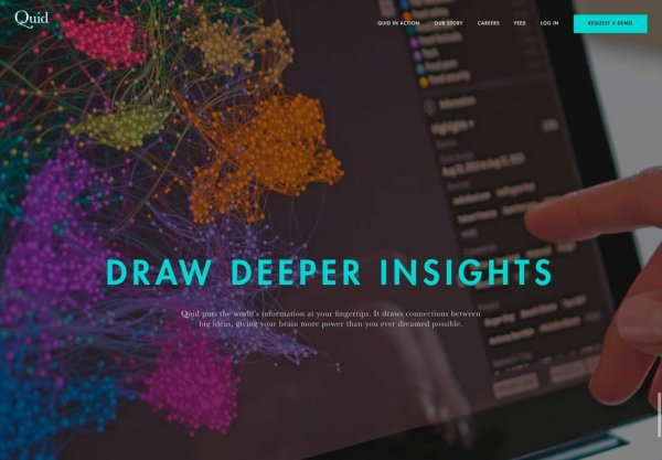
Quid
Homepage
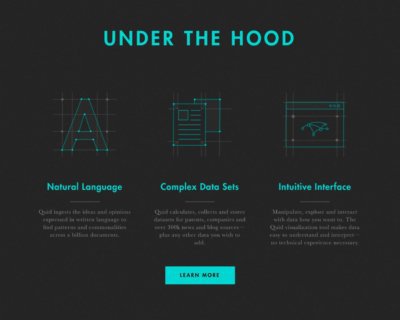
 Quid is a perfect example of a B2B web design that takes the lead and guides you where you need to go.
The front page greets you with four simple words: “Turn text into context.”
Okay, but what does that mean?
Don’t worry, they’ll tell you. They’ll tell you in more depth than you knew you wanted.
A downward arrow accompanies these four words, and from there, B2B, the web design takes over.
You’re led down, down, down, and every step of the way, you’re greeted with simple but eye-catching graphics and a short paragraph on what Quid can do for you.
Honestly, I kept scrolling just to watch the graphics slide in, and I read each paragraph because I wanted to know what I was looking at in the graphic beyond the pretty colors.
I learned about the company by accident because the website drew me in.
And Beyond
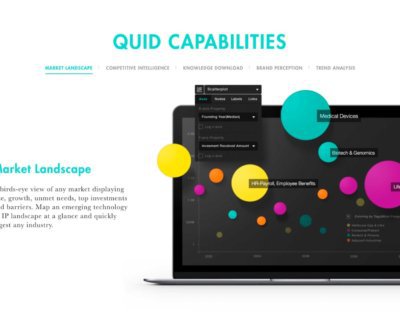
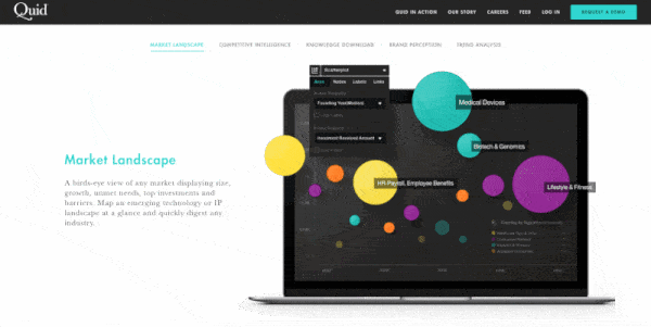
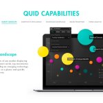
 The rest of Quid’s website is as well done as the homepage.
When you click on the “Quid in Action” tab, you’re again guided down the screen and provided with sample questions that a client might have about the company AND in-depth answers.
You don’t even have to come up with questions yourself!
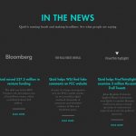
Quid’s website also does an outstanding job of conveying their In the News stories about their successes, such that the reader is left with a “how did I miss that?” feeling.
Pro-Tip
This B2B web design is a great example of keeping things simple. Three words, a button, a logo, and a tiny pager/menu on the full-screen image make it easy to figure out what’s next.
 People visiting B2B websites often want something they can understand quickly.
You don’t want to overload them with too much information about what you do and why they need to stay and learn more — it should be apparent from the beginning.
This website tells a clear story.
It starts with a simple tagline to intrigue the reader, then builds on that story as you scroll.
We’re partial to Quid’s interactive graphics in the middle of the page. This a very nice touch that we recommend to all our B2B website clients, like this one.
Explore Quid’s site. Check out each stream to see how they guide you to all the information you could need without overwhelming you.

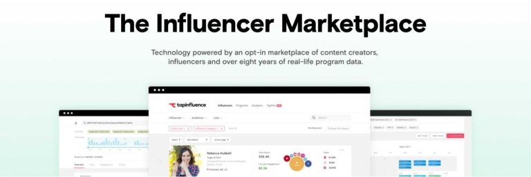
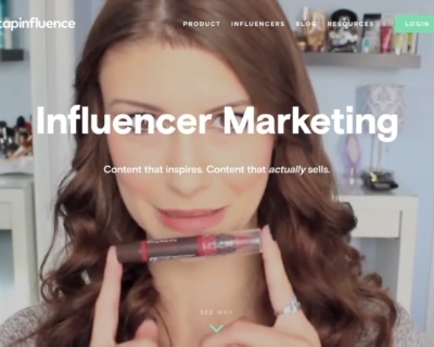
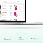
TapInfluence
Some B2B web designs target more than one audience. TapInfluence is one of those, as they have to target clients and potential Influencers themselves.
Just like with Quid, we have the same scrolling setup that leads you down through the information, but unlike Quid, TapInfluence isn’t just informing you about services.
They have to communicate their business, why they need it, find an influencer, and who the influencers are.
That’s a lot. There are over 50,000 influencers.
Homepage
 They plunge you right into the good stuff.
- You find out what the influencer categories are with four tabs that you can pick from.
- You get to see a featured influencer from each category with a catchy image and the number of people that influencer reaches.
- And you find out why Influencer Marketing is effective.
All that is in four tabs, one image, and one short paragraph.
But the best part about their homepage? You can click on anything.
We’ve all had that frustrating experience where a website is listing off all the amazing things they can do for you, but when you hover your cursor over one of those amazing things to find out how they do it or what it is…nothing.
This is not the case for TapInfluence. If you want to know more, all you have to do is click.
And Beyond
 This is one of the places where TapInfluence’s B2B web design shines.
To stick with my previous metaphor, after you pick the stream you want from the main menu, they do much of the work without overwhelming you.
However, because so many moving pieces are involved in their services, TapInfluence takes a slightly different approach than Quid.
Instead of a continuous current driving you downstream through all the information, we have more of a “Choose Your Own Adventure” format.
You get to pick the endpoint of your search without having to wade through the information you aren’t interested in.
What sounds right for your business? Continuous streams or “Choose Your Adventure?”
More screenshots


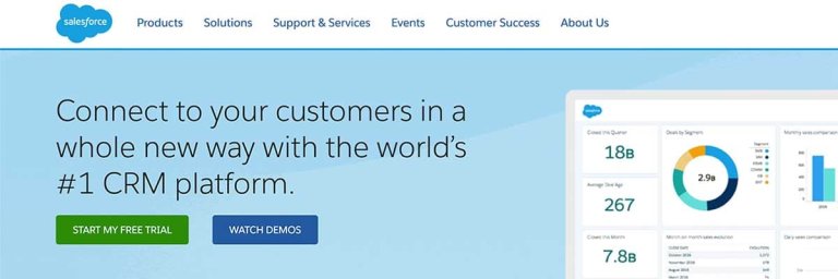
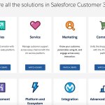
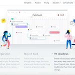
Salesforce
Okay, scenario:
- You’re planning out your website.
- You’re coming up with all the tabs you need, all the sub-tabs, all the sub-sub-tabs
- Now all the information that needs to go under those tabs and sub-tabs and sub-sub-tabs.
- And finally, you’re done.
You now have 97 tabs. Oops.
This is how I imagine Salesforce’s process went, but they do a remarkable job of making it work.
You can too.
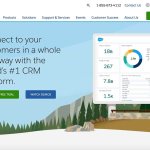
Homepage
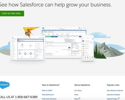 I’m going to be honest here. There is a lot of information on this page. A lot.
Want to know why it works?
Because you can click on everything, and if you can’t, there’s a special tab at the bottom where you can access more information or a demo.
Want to know why else it works?
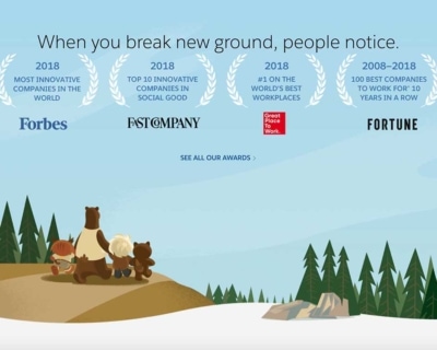
As you’re scrolling on and on forever, you have a quirky little family to keep you company, complete with the short older adult, the kid in a bear costume, and, well, a bear.
These picturesque graphics are with you the whole time; You’ll find these little cartoon characters in every image featured on the home page, even the technical ones.
The images let you take a breath and digest everything on the page without feeling like you’ve been dragged into a serious, information-overload wormhole.
And Beyond
 This is where your 97 tabs come in.
The good thing about Salesforce? Every main menu tab has its map to guide you to the tab you’re looking for.
Sure, it’s a little overwhelming at first glance. But the organization of the website makes it overwhelmingly easy.
And don’t worry. Your little cartoon friends will follow you into every one of those 97 tabs.
We checked.
More screenshots


Looking to design a stellar website for your business to grow online? The award-winning team at 3 Media Web can help you get started.
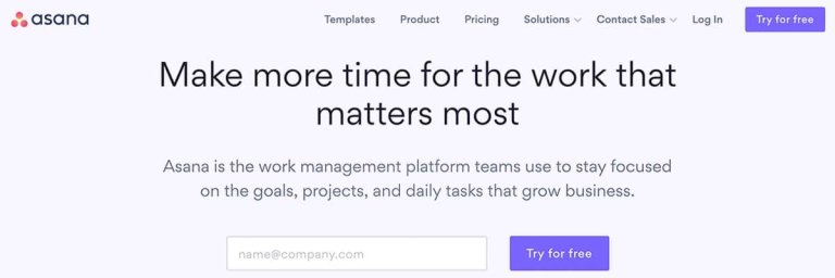
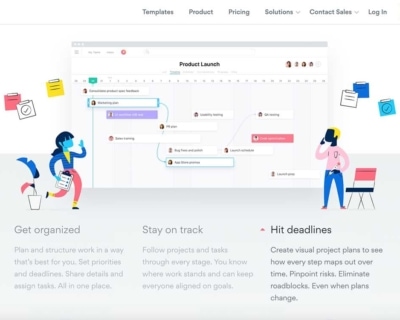
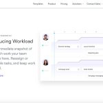
Asana
Here’s a new one. Asana is a work management platform that you can use to spy on your coworker’s workload.
Just kidding. Kind of.
But Asana’s B2B web design does one thing well. Animated graphics.
Homepage
 You know when you’re trying to learn how to use a new site, and you spend ten minutes on YouTube mesmerized as a phantom cursor takes you on a tour through the whole website?
No? Okay, maybe it’s just me.
Anyway, this is kind of what Asana’s website does for you.
You’re immediately greeted with a brief description of the company and a half-screen graphic that gives you a brief tour of the software. Every screenshot includes a blurb of how this Asana screen can help you.
As you keep scrolling, you’ll come to a video where you can watch Asana more fully in action.
No YouTube search is necessary.
And Beyond
 Asana’s graphics are great, animated or not, and everyone adds important information about the platform.
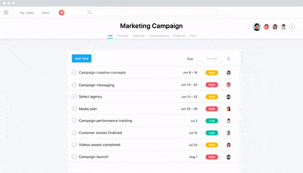
An amazing example is on Asana’s “Product” page, where every graphic shows you exactly what they’re talking about.
For example:
There is a single sentence about the boards in Asana where you can create tasks. The graphic shows one of these tasks being moved from the “In Progress” column to the “Done” column.
Look. You’ll see why this is cool.
Animated graphics are a great way to keep customers interested while helping them understand exactly what your business can do for them.
More Screenshots
B2B Web Design Patterns
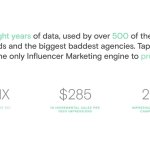
So now that we’ve seen some examples let’s break it down even more. Most (89%) B2B Buyers are doing their online research before they ever contact you.
So…your website is your biggest sales tool. This means it must shine and stand out among your competitors.
Your site has to be lightning-fast and make it easy for users to find crucial, relevant information about products and services and targeted content such as success stories and case studies.
It needs to speak to your buyer.
A website that focuses on usability and architecture is the key to exposing the right content to your target audience.
 Not convinced?
Here are two good reasons why you should be…
1. According to the Demand Gen Report, B2B customers today progress more than 70% of the way through the decision-making process before ever engaging a sales representative.
That means you don’t know the customers you could be losing before the sales process even begins.
2. Buyers in all industries use digital content to make purchasing decisions, and B2B is no different.
 An overwhelming majority (89%) of B2B researchers use the internet in their research process, and they conduct 12 searches before engaging on a specific brand’s site.
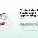
Qualities of a Sales-Ready B2B Web Design
Beyond the bells and whistles and current/emerging trends, the best B2B websites all have (or should have) a few main things in common, regardless of services or industries…
- They can deliver results.
- They offer an intuitive and effective user experience across the board.
Here are some additional factors that go into creating an unstoppable B2B website centered around successful user experience and design:
![]()
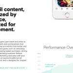
Cohesive Overall Branding + Messaging
As in life, you rarely get a second chance to make a first impression on the internet.
So, good for you! You’ve captured a prospect’s (minimal) attention.
But now, you only have a concise amount of time to prove and convince them that you offer and can deliver what they’re looking for AND that you can do it better than your competitors.
This is where your content and design work together to make your case – quickly, boldly, and efficiently.
Your content and design should flow seamlessly and help you stand out from competitors by making a clear case for what sets you apart.
![]()
Easy-to-Use Navigation
By the time they’ve reached your site, most B2B buyers and users have already done a considerable amount of research and know exactly what they’re looking for.
Helping them find what they’re looking for as quickly and seamlessly as possible is critical to getting that almighty conversion.
A clean, clear, and easy-to-understand navigation should be a priority for every B2B site.
![]()
Fast Load Time
We are impatient people.
You can design the most beautiful, powerful, and otherwise useful website without losing your visitors to a slow-loading page.
And there’s more bad news.
Search engines are getting wise to how humans want to interact with the websites they visit, and as such, page load times are increasingly becoming a factor in your website’s SEO rankings.
“But it’s just bad service!” You cry in vain.
Nope, sorry. Not good enough.
According to industry data, nearly half of people surveyed expect a website to load within 2 seconds and will abandon a site after a whopping 3 seconds if a page takes too long to load.
Shiny and sophisticated graphics and design elements may look great, but they are irrelevant if they slow down your site’s loading time to the point that visitors leave before they even see it.
![]()
Strategically Organized User Content
All content is not created equal regarding your sales funnel and the B2B buyer’s journey.
Unfortunately, I know.
While content planning is not an exact science and generally requires a fair amount of trial and error to get right (this is where data and analytics information do the work for you), the good people at usability.gov recommend accounting for the following factors when planning your content strategy:
- Determine topical ownership areas
- Decide taxonomy
- Design workflow for content production
- Establish voice and brand identity
You want your content to flow so that viewers can easily find what they’re looking for, but you also want it targeted and specific enough to convert.
![]()
Relevant Targeted Buyer Content
Targeted content is just like casting a fishing rod.
Targeted content is designed to reach a very specific demographic: namely, the people you’re looking to engage.
For B2B purposes, casting a wide net with your content may seem like the best way to reel in as many fishy prospects as possible, but the opposite typically turns out to be true.
According to Alexa:
Targeting in marketing is a strategy that breaks a large market into smaller segments to concentrate on a specific group of customers within that audience.
It defines a segment of customers based on their unique characteristics and focuses solely on serving them.
Instead of trying to reach an entire market, a brand uses target marketing to put its energy into connecting with a specific, defined group within that market.
If you’re fishing for bass, you don’t want to throw out a net and come up with a bunch of tuna, some halibut, seaweed, and maybe three of what you want.
![]()
An Easy-to-Use Content Management Platform
So many people claim that they hate reading.
Then they get mad when they can’t find the information they’re looking for.
Once your content plan and strategy are solid, you want to create a process that makes posting regularly as seamless and easy as possible.
Your content management platform is the backbone of your operation. Several options are available depending on the scale of your content program, the size of your organization, the scope of your content program, your SEO requirements, and technical specs.
Some of the most popular and effective content management programs include:
- WordPress
- Drupal
- Squarespace
- Joomla
- Contentful
But many more options are available for all budgets and organizational needs, from the smaller boutique to enterprise-level agencies.
![]()
Relevant Calls to Action
What is the best way to get someone to do what you want them to do? Just ask.
So simple it can’t possibly work, right?
Well, a clear and relevant call to action tells your site’s visitors where and how to take action and find what they came for.
If you don’t include strong calls to action, you’re telling your site’s visitors to put their wallets away and keep moving or to take their time and attention elsewhere.
![]()
Marketing + Sales Automation
Oops…sorry, not that kind of marketing.
From lead generation to greater efficiency to improved ROI reporting, marketing and sales automation make your efforts more successful and your campaigns more productive.
How do you ask?
Automation technology allows you to measure your results to understand what’s working, how to make improvements, and whether to cut the dead weight altogether, should the need arise.
You can qualify leads, launch strategic email campaigns, and reach a broader and more targeted audience in a fraction of the time and cost it would take to go old school.
![]()
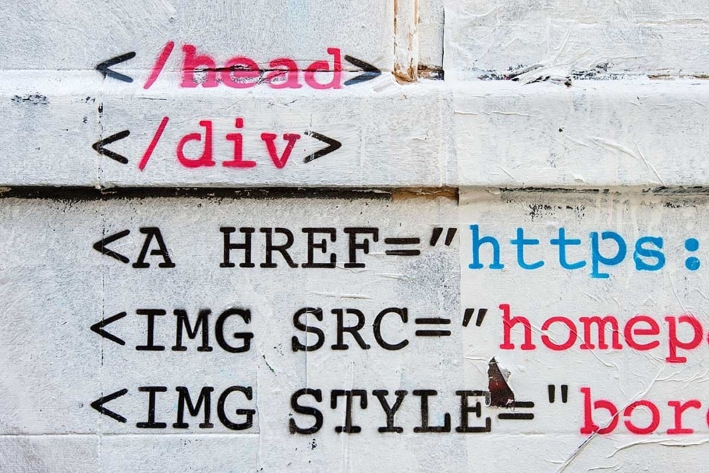
Clean, SEO-Friendly Coding
As with your site’s front end and user experience design, less is usually more regarding your source code.
Gone are the days of relying solely on keywords and backlinks to get the SEO job done.
Search engines are constantly evolving and getting more sophisticated to ensure that they’re serving up the most relevant and targeted results, so be sure to take your SEO into account on the backend as well.
Here are some of the factors that make for SEO friendly source code:
- Title tags
- Meta descriptions
- Structured data
- H1 tags
- Alt image text
- Indexed pages and links
![]()
Mobile Responsive
We’re addicted.
As such, this one is no longer optional.
Like page load times on your website, your site will lose your audience if it is not optimized for mobile.
This is where most web traffic comes from, and it will continue to accelerate shortly.
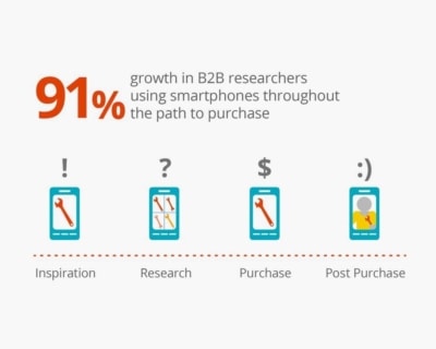
According to statistics, over half of all search traffic is already conducted on smartphones and tablets.
And remember that B2B prospects conduct an overwhelming amount of their research BEFORE visiting an agency or service provider’s website, so if you’re losing them on mobile, you’re losing them, period.
More Sales-Ready B2B Website Examples
Had enough of me yet? Too bad.
Here are a few more sites that have struck a great balance between clean, intuitive design and a great user experience and functionality.
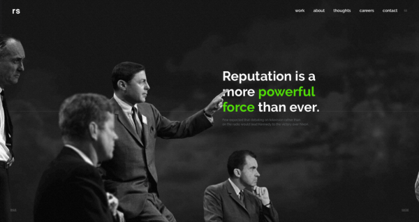
Reputation Squad
Do you need meaningful and actionable data and analysis on a product launch, market patterns for a specific niche, demographic info for influencers in a particular sector, or up-to-the-minute info on a full-blown crisis?
Even I had a little trouble getting all those words out.
But Reputation Squad has covered you, complete with 24/7 monitoring, report capabilities down to the hour, and real-time recommendations.
The site design is cool, modern, and appropriately edgy with a hint of gravitas while remaining super easy to navigate.
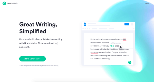
Grammarly
The internet is sadly littered with grammatical mistakes that make an English teacher weep.
But not only is there simply no room for error in B2B content, bad grammar, poor language usage, and – shudder – plagiarism are just plain bad for your SEO.
Grammarly has become the go-to for content marketers and anyone publishing digital content.
With a simple “copy and paste” of your text, the Grammarly police will let you know if you’ve slipped into the dreaded passive voice, where your prose could use a little tightening and pruning, and whether or not you’ve (inadvertently, of course) created duplicate content.
It corners the market on minimalism and flat design for peak effectiveness.
Plus, it’s as mobile responsive as they come, and who doesn’t love taking a second out of their busy day to check their grammar?
DemandZen
DemandZen covers the nuts and bolts of inbound marketing, from content to lead generation and cold calling (yes, some people still do that).
Most importantly, their services are compatible with their client’s existing CMS and automation platforms, like HubSpot and Marketo.
Hitting all the right notes across design, functionality, user experience, and tech specs can seem like a colossal task.
The best sites keep it simple (at least from the user’s perspective) while incorporating sophisticated and intelligent brand strategy and sales and marketing best practices to make an impact and get the most of every click and visit.
Avoid These Common Web Design Mistakes
Are you considering a web redesign or planning on building an entirely new website? If so, you will want to avoid these common web design mistakes we’ll discuss below.
Is Your Company’s Website A Victim of Common Web Design Mistakes?
As exciting as making a new website is, it will still take a lot of experience and hard work. If you don’t know what you’re doing, a few bad choices can lead to a website that doesn’t achieve your business goals. And because tools and processes develop so quickly, something that worked six months ago might be outdated or ineffective.
1. Confusing and Difficult Navigation
Have you ever visited a website that made it difficult (if not impossible) to find what you are looking for? Like most people, you likely left the website pretty quickly to find the info you need elsewhere.
Navigation is the unsung hero of web design.
When referring to a website from another site or search results page, 50 percent of people will use a website’s navigation menu to explore the site. That’s how important it is to make sure your site’s navigation is intuitive to use.
Navigation Menu Best Practices
- The navigation menu needs to be easy to find; put it in a location where visitors expect to see it. I.e., across the top or on the left-hand side of the page.
- Is the navigation menu consistent in location? Make sure it’s in the same spot on your website pages.
- Use the “Serial Position Effect” to your advantage. Humans tend to remember the first and last items on a list most easily. Apply this to your navigation menu by making the two most important pages the first and last items in your navigation menu.
- Don’t overdo it. Keep your navigation menu to about seven or fewer items. Make sure each item in the menu is titled in a way that makes it obvious what will be on the page.
Furthermore, a search feature should be considered an integral part of your website’s design.
And while a navigation menu is incredibly important, intuitive navigation goes beyond the menu! Avoid web design mistakes that make navigation difficult. For example, your logo should always link to your homepage.
Does Your Site and Its Pages Have A Logical Layout?
Make sure there is a logical flow to your page layout based on why a person would be on that page in the first place. For instance, if a person uses your navigation menu to access your contact page, they will expect the contact info to be the first thing they see. Avoid the mistake of making them scroll and hunt for the best way to reach you.
2. Not ADA Compliant
This is a big web design mistake and, unfortunately, one that’s overlooked far too often. Most people are aware of the Americans with Disabilities Act (ADA) which requires businesses to make their locations equally accessible to all people. The law has specifications for accessible parking stalls, bathrooms, etc.

However, what many people don’t know is that the ADA includes business websites as well.
That’s right, it doesn’t just apply to physical locations.
If your business website doesn’t meet the current Web Content Accessibility Guidelines (WCAG 2.0) standards, you could be at risk of:
- Losing nearly 20% of potential customers because they can’t use your website
- and putting your business at risk for an ADA non-compliance lawsuit
FURTHER READING: Accessibility in Digital Marketing: Be an A11y
What Is WCAG?
Because the ADA was introduced when the internet was still in its infancy, no specific language was included in the ADA citing how websites could become compliant. Or non-compliant for that matter.
However, the set of accessible guidelines developed by the Web Accessibility Initiative (WAI) is widely viewed as the protocol required to make your website ADA compliant, including in a court of law.
“Web Content Accessibility Guidelines (WCAG) 2.0 covers a wide range of recommendations for making Web content more accessible. Following these guidelines will make content accessible to a wider range of people with disabilities, including blindness and low vision, deafness and hearing loss, learning disabilities, cognitive limitations, limited movement, speech disabilities, photosensitivity and combinations of these. Following these guidelines will also often make your Web content more usable to users in general.”
— WCAG 2.0
The WCAG 2.0 includes guidelines that will make your website readable to screenreaders which output the contents of your website into an audio reading or braille. The guidelines cover a multitude of items including contrast ratios, font sizes, as well as code guidelines.
At 3 Media Web, we take ADA accessibility very seriously. Our development team uses the Web Content Accessibility Guidelines 2.0 standards to test and build business websites. We recommend all web developers do the same.
3. Clever To The Extent That The Site Is Unusable
Of course, web developers want to be clever and extra creative when designing websites. All is well and good until it gets to the point where they’ve completely “reinvented the wheel” so much that visitors to their sites don’t know how to use it.
Limit how many gestures and custom swipes are built into the user experience of your website. Think about the copy on your site and make sure it’s not so clever it will turn people off or be difficult to understand.
Lastly, If it isn’t broken don’t fix it. In other words, don’t be tempted to redesign elements that most of your website visitors are already familiar with. Buttons don’t need to be fancy dials. Call-to-action buttons can clearly state what they do rather than recite a catchy phrase.
Randy Hunt, the Creative Director for Etsy, explains it really well…
Imagine yourself as a visitor to your website who has just filled out some information, and you want to save it. Would a CTA button that reads “SAVE” or one that reads “LET’S DO THIS” be the more obvious choice to save your work?
The reality is clean, simple designs will win over the hearts of more customers than a flashy ones they can’t navigate or get to function properly. Sure, there’s a fine line between clever and boring.
Just remember there’s also a fine line between innovation and overzealous design. Chance are visitors to your site didn’t go there to have to relearn how to do basic tasks in new ways.
FURTHER READING: Four Necessary Steps to Take Before A Website Redesign
4. The Overly-Optimistic DIY Approach
We know it is tempting to go with an “easy out” when it comes to web design. Platforms such as Wix, SquareSpace, and even pre-made stock WordPress templates make it look easy and affordable. In actuality, that’s hardly ever the case.
Why? There are at least a few reasons I can think of…
The Learning Curve
First, the drag-and-drop or what-you-see-is-what-you-get (WYSIWIG) appeal of templates is a bit of a misnomer. While it may be easier than learning to code and develop websites from scratch, there’s still a learning curve to get a template looking at least somewhat good.
You’d be surprised that the learning curve can also take a long time to surmount.
Afterall Time is Money
This brings us to another reason to opt out of using a cookie-cutter web design: money. Many business owners go the DIY route thinking they are saving a few bucks.
Guess what?

It hardly ever works out that way. If there’s one thing a business owner doesn’t have enough of, it’s time. Time is money, and the more time you spend trying to figure out how to use an interface like Wix, the less time you’ll have to do other important tasks.
Disappointing End Product
And that’s just the beginning. More often than not, people who go this route never actually end up with the website design they want, much less need. They’re not always to blame either.
Templates and WYSIWIG interfaces are meant to serve the masses, meaning they are very limited in the amount of customization that can be applied to them.
You may be able to choose between a selection of fonts and add your images, but as far as custom menus, controls, user flow, and user interface it’s nearly impossible to build a perfectly functioning business website using one of these services.
Unfortunately, when business owner realizes this common web design mistake, they’re usually at their wit’s end with it. It’s not uncommon for them to give up on it and contact a web design agency at that point.
FURTHER READING: Custom Website Design vs. Templates — Let’s settle this.
The smart thing would be to skip the DIY project altogether. If it’s the price you’re concerned about, consult a web developer to see your options. The cost of having a custom web design made for you may be more attainable than you think.
Furthermore, it will save a ton of time and give you a better chance of standing out from the pack.
5. A Non-Responsive Design

Having a mobile-friendly site is such an important aspect of web design, it’s slightly baffling that people are still making this common web design mistake. If your website isn’t responsive design, it’s almost certainly costing you a heap of traffic.
Searches originating from a mobile device have officially outnumbered searches from a desktop environment. That means more people use their mobile devices than a computer to find what they’re looking for on the internet. With that in mind, having a website that performs well on a mobile device is crucial to keeping visitors on your site.
Since the screen size is much smaller on, say, a smartphone than it is on a laptop, special consideration needs to be given to the layout to ensure a seamless web experience across devices.
Additionally, how users interact and navigate a website on a mobile device is much different from how they use a website when visiting it from a computer. On a mobile device, touch and gestures reign supreme, which isn’t necessarily the case on a desktop.
Furthermore, it’s not just visitors to your website who will judge it based on its mobile responsiveness. Google penalizes non-mobile-friendly sites by not allowing them to rank as highly as a site with a mobile-friendly design.
It’s wise to go all in to make your website mobile-friendly. One word of advice is to not do it at the expense of other important elements on your site. For example, don’t focus so much on making your site an outstanding responsive design that you won’t have enough resources to give it equally outstanding design and graphics.
It’s a total package. So, make sure you also pay attention to on-page SEO, content marketing, navigation, and intuitive flow.
FURTHER READING: Why Do I Need a Website with Responsive Design?
The Takeaway: Keep It Simple To Common Web Design Mistakes
The truth is, you have fewer than 10 seconds to get visitors to your site interested in what your site has to offer, or you’ll run a strong risk of losing them.
If you think that number sounds low, I’ve got a shocking statistic: the average human attention span is about eight seconds. That’s a full second shorter than a goldfish’s attention span. Yikes! Needless to say, when designing a website, the priority needs to be on the customer and their overall user experience if you want to keep people on your site.