
Every year sees new trends in web design. New design motifs appear organically as designers play, explore, and discover what customers react well to. Many are responses to new technology or SEO developments, while others develop as responses to design trends in other areas. Still more are reactions to established eye-catching web design trends that have run their course.
Here are seven eye-popping web designs you may have been noticing. Many of them have been slowly gaining headway, and you can expect to see them blossom and come into their own as the year continues.
1) No more interstitials or pop-ups
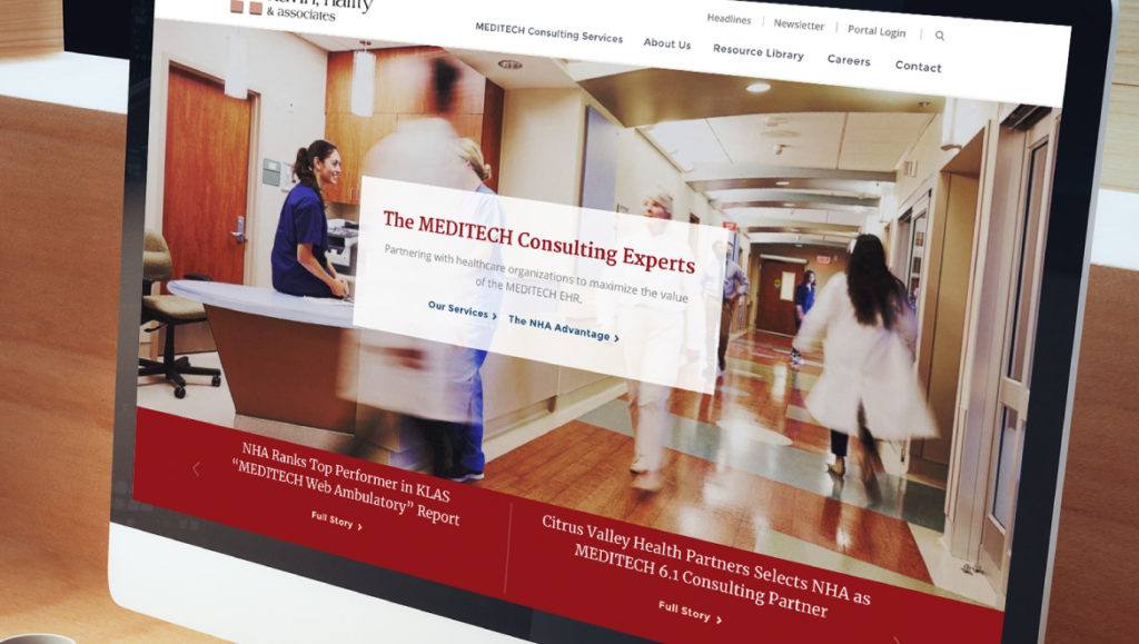
Whether or not you know interstitials by their name, you probably know them when you see them. They’re those images, blocks of color, web forms, or other distractions that interrupt your experience of a webpage while you’re scrolling through, often to encourage you to subscribe to a site’s newsletter or follow its social media account.
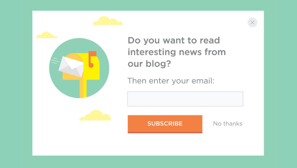
Interstitials and pop-ups are almost universally loathed by users: they draw attention away from a page’s content, and toward the page’s self-promotion. But it’s been difficult to get web designers to quit using them: they’re an easy way to encourage users to get more involved with the story of the site’s brand. While it’s not clear the degree to which they increase user involvement, they don’t seem to hurt it — irritated users just click past the interstitial and move on to the content.
However, in late 2017, Google forced web designers’ hands. They announced they’d punish sites’ SEO ranking when they use these annoying elements. SEO makes or breaks most websites, so you can expect to see fewer intrusive interstitials over time.
2) Gradients that aren’t
A gradient is a slow, subtle change from one color to another, over a visual space. They’ve been a mainstay of web design for many years since they create visual depth and interest.
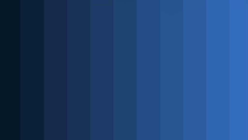
However, following a broader design trend, many designers are leaning away from classic gradients in favor of something a little different: gradients with clear separations between different colors. Trendsetting web designers have been using this technique for a while, and you can expect to see more of this over time.
3) Subtle animations
Lately, there’s been a trend to add animations to everything. (New scripts have made it easier to do.) Web designers have a tendency to try out everything when it’s new — remember marquees and blinking text in the ’90s? While many websites’ animations have been legitimately eye-popping, animation is one of those things it’s easy to go overboard on.
Now that the novelty’s wearing off, designers are choosing to deploy animations more carefully. Expect to see more carefully-deployed and subtle animations, which enhance a page rather than serving as a distraction.
4) New takes on grids
Grids have been a mainstay of modern web design for many years. They’re an easy way of carving out space for a website’s different elements, and users have an intuitive understanding of them.
However, grids can be a little tired. Users are very used to them by now, and crave a new look and feel for many sites. For many years, web designers have slowly been experimenting to find ways that “break out” of the traditional grid format — including unconventional or broken grids.
Striking a balance between innovation and visual chaos has always been a struggle with grid re-designs, and many users find broken grids disorienting. But that disorientation is something a skilled web designer can use to their advantage to create an eye-catching web design.
5) Serifs are back
Sans serif fonts have been in vogue online for many years. They’re sleek, modern, and easy to read on screens, so it’s no wonder web designers love them. By contrast, serif fonts are often seen as being stuffy and old-fashioned.
But designers are slowly beginning to turn around and use serifs again: they offer a timeless, sophisticated look, and have become rare enough that they can turn users’ heads.
When using serifs, remember that they can be a little difficult to read on a computer screen. This might be part of why web designers aren’t going all-in on serifs just yet. You’re most likely to see them as an accent to sans-serif body text — for instance, in a heading or a logo.
6) Rounded corners
Everything old is new again. There was a period a few years ago when rounded corners were all the rage, on both text entry boxes and other design pieces.
Web designers briefly phased out rounded corners in favor of a sharp-cornered, flatter-looking design. (Some pages have tried to split the difference, with subtle snub corners.)
But now, highly rounded corners are becoming chic again. Twitter recently rolled out a pleasingly round-cornered text entry box, and it’s likely other sites will follow suit.
7) Diagonal breaks
Horizontal breaks have been part of the web since the early HTML days. And you can make a case that standard-issue grid designs are really just vertical breaks. Users are very used to seeing web pages where everything’s at neat right angles.
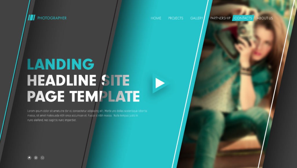
So it’s no wonder that, as web designers jump on these web design trends and lean into unconventional grid designs, diagonal breaks are becoming trendy. They create movement, tension, and eye-catching web design that users love, and cultivate a very different user experience than neatly-gridded pages do.