Last updated: July 3, 2026
TL;DR:
- Visitors judge your website’s visual appeal in about 50 milliseconds, so the design has to earn trust before anyone reads a word.
- Four visual elements decide whether a site feels credible or cheap: color, typography, navigation, and content.
- Color sets the emotional tone and must stay readable, including for the 1 in 12 men affected by color vision deficiency.
- Typography and navigation make a site usable; content is the visual element that actually converts.
- In our work with fintech firm Hum Capital, replacing an incongruent design with a clean, aligned one lifted traffic 39% and conversions 7%.
- Use the comparison table below as a quick audit of your own site, then fix the weakest element first.
What are the most important visual elements in web design?
The four visual elements that most affect website UX are color, typography, navigation, and content. Color sets the emotional tone, typography makes text readable, navigation makes the site usable, and content does the converting. Get all four right and the design supports the user instead of fighting them.
Visual elements make or break a website’s user experience. Non-visual factors matter too, but visitors notice how a site looks first, and they decide fast. According to research published in Behaviour & Information Technology (Lindgaard et al., 2006), users form an opinion about a web page’s visual appeal in roughly 50 milliseconds. Your design has about 0.05 seconds to make a good first impression before a visitor decides whether to stay.
With that in mind, here are the big four visual elements that shape your website’s design and the user experience it delivers.
Does your website need a boost in the UX or design department? Our team can help.
1. How does color affect UI/UX design?
Color is the first visual element a visitor processes, and it directly shapes how they feel about your brand. As painter Wassily Kandinsky put it, “Color is a power which directly influences the soul.” On a website, the right palette builds trust in milliseconds; the wrong one creates friction before a single sentence is read.
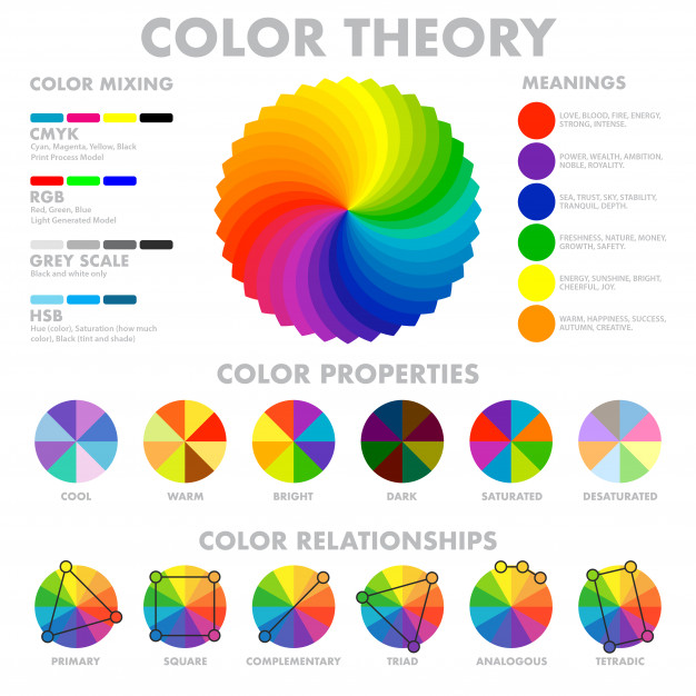
Color carries consistent emotional associations that smart marketers design around:
- Yellow feels cheerful and optimistic.
- Green is often associated with money and growth.
- Blue signals trustworthiness and stability.
- Orange conveys energy and happiness.
- Red evokes urgency and strong emotion.
Because different colors trigger different responses, the palette on your site should align with your brand values, not just personal taste. Color is one of the most consequential visual elements in custom web design, so it deserves deliberate choices. In our work with fintech company Hum Capital, part of moving the brand from an incongruent look to a credible one was a new blue color palette that better matched the sophistication of their AI-powered funding platform.
Using color to influence user behavior
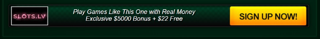
The color of an interactive element can measurably change how users act. In a frequently cited example, the gaming site VegasSlotsOnline ran an A/B test on its sign-up button. The original green button converted at roughly 10 to 15 percent. The team tested three new variations, including a yellow button reading “Sign Up Here.”
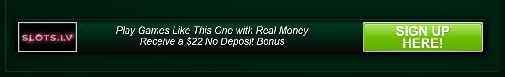 Button style and wording barely moved the numbers. Changing the color from green to yellow did. The yellow variation produced a 175 percent increase in conversions over the green version, a reminder that a single color choice can outperform a full redesign.
Design for color vision deficiency and low vision
Color choices also determine whether your site is usable by everyone. Color vision deficiency (CVD), commonly called colorblindness, affects about 1 in 12 men and 1 in 200 women, and it makes certain color pairs hard to tell apart. The most common confusion is between some reds and greens; blues and yellows are affected less often.
Conditions like near-sightedness and astigmatism can also reduce a person’s ability to perceive color and contrast, so a palette that relies on color alone to signal meaning will fail for a meaningful share of your audience. Building accessibility into your color decisions from the start is far easier than retrofitting it later.
For text legibility, follow the contrast thresholds in the Web Content Accessibility Guidelines (WCAG). According to the W3C’s WCAG 2.2, body text needs a contrast ratio of at least 4.5:1 against its background, and large text needs at least 3:1, to meet the AA standard. Free tools like Toptal’s Colorblind Web Page Filter and online contrast checkers let you simulate your site and verify those ratios before launch.
2. How does typography work as a visual element?
Typography is the visual element that makes your words readable, and it influences UX far more than most people expect. Web standards pioneer Jeff Zeldman has argued that design is “90% typography.” Whether or not you accept that figure, bad typography is something visitors feel immediately, even if they cannot name what is wrong.
A lot can go wrong with type. Common typography mistakes include:
- Over-stylized fonts that are hard to read, like eccentric script faces.
- Letter spacing that is too tight, making words run together.
- Font colors that blend into the background.
- Dated styles that make a brand feel old.
- Fonts that clash with the brand or the rest of the page.
Typography vs. typeface vs. font: what’s the difference?
These three terms are related but not interchangeable. Typography is the art of arranging letters and characters. A typeface is a group of characters with a shared design, such as Arial, Courier, or Times. A font is a specific style and size of a typeface. In short: Arial is a typeface, while 12pt italic Arial is a font.
Website typography best practices
Strong website typography comes down to restraint and readability. Apply these practices to keep text working as a visual element rather than a distraction:
- Limit your typefaces. One or two is usually enough, often one for headings and one for body text, used consistently across every page for a cohesive feel.
- Favor standard, legible faces. An unusual custom font can pull attention away from the message; if people struggle to read a page, they leave for a competitor’s.
- Scale for every screen. Button, heading, and body text need different sizes, and all of them must stay readable from large desktop displays down to small phones.
- Keep strong color contrast. Apply the same WCAG ratios as above, 4.5:1 for body text and 3:1 for large text, so the type stays visible for everyone.
3. Why is navigation a visual element you can’t ignore?
Navigation is the visual element that determines whether visitors can actually use your site. How easy or hard a site is to move through can make or break the experience, because content that cannot be found might as well not exist. A clear, well-placed menu lets first-time and repeat visitors reach what they need without thinking about it.
 Effective navigation design follows a few reliable rules:
- Put the menu where people expect it. Across the top or in a left sidebar, in the same place on every page. There is no need to reinvent the wheel.
- Label links in plain language. “About Us,” “Contact,” and “Find a Retailer” beat clever names that only the author understands.
- Limit the number of links. Too many options overwhelm visitors; prioritize the actions you want them to take.
- Make links look like links. Use consistent, obvious styling so visitors recognize what is clickable.
Navigation is really a question of structure and flow, which is why it pays to ground menu decisions in a clear website strategy rather than guesswork. If you are improving a site solo and not sure where to begin, our guide on how to prioritize website tasks when you’re a team of one or two can help you sequence the work.
4. Why is content a visual element too?
Content is the visual element with the most potential to convert, because it is the reason visitors came. Typography and color are the backup dancers; content is the main act they support. When the other visual elements are designed to complement the content rather than compete with it, the whole page works in harmony.
During design, it helps to know the type of content a site will carry, so layout, color, and type can be built around it. Content is more than copy, too: video, photography, and graphics are all content, and a consistent style and tone across them keeps the experience cohesive and free of distraction.
“A successful visual design does not take away from the content on the page or function. Instead, it enhances it by engaging users and helping to build trust and interest in the brand.” — Usability.gov
Getting content and design to reinforce each other is also where a dependable web partner earns its keep. If you have ever been burned by a vendor, our take on why some partnerships fail and how to avoid the pitfalls is worth a read before you choose who builds your next site.
What is visual hierarchy in web design?
Visual hierarchy is the deliberate arrangement of elements so the eye moves through a page in order of importance. Designers create it with size, color, contrast, spacing, and position, guiding attention to the headline, then the key message, then the call to action. Get the hierarchy right and all four visual elements point the visitor toward what matters most.
When should you redesign your website’s visual design?
Redesign when the visual elements actively work against you: the look no longer matches your brand, bounce rates climb, mobile users struggle, or the design predates a major shift in your product or audience. A useful test is our audit table below. If two or more rows are weak, a coordinated redesign usually beats patching one element at a time. In our work with Hum Capital, a fintech platform whose site suffered from poor UX, slow speed, and an incongruent design, a full redesign, rather than piecemeal fixes, delivered a 39% jump in traffic and a 7% lift in conversions right after launch.
The four visual elements at a glance
Use this table as a quick audit of your own website. For each visual element, check what it is responsible for, the mistake that most often undermines it, and the fastest way to improve it. Whichever row is weakest on your site is the best place to start.
| Visual element | What it does | Common mistake | Quick win |
|---|---|---|---|
| Color | Sets the emotional tone and builds trust in milliseconds. | A palette chosen by taste that ignores contrast and accessibility. | Align colors to brand values and verify 4.5:1 text contrast. |
| Typography | Makes text readable and reinforces brand personality. | Too many fonts, or styles that are hard to read on mobile. | Limit to one or two faces and test legibility on small screens. |
| Navigation | Lets visitors find content and move through the site. | Clever labels and too many links that overwhelm users. | Use plain labels in a predictable, consistent menu location. |
| Content | Delivers value and drives the conversion. | Design that competes with the message instead of supporting it. | Design layout, color, and type around the content, not after it. |
Bringing all the visual elements together
There is a fine balance between design and usability, and the design should never get in the way of the user. A good web designer treats color, typography, navigation, and content as one system, where every visual element earns its place by helping the visitor. That systems view is what turns a redesign into results: when we rebuilt Hum Capital’s site so the design finally matched the brand and the message, traffic rose 39% and conversions climbed 7% almost immediately.
Now that you know what to look for, compare these four elements against your own site and find the room for improvement. When you are ready to turn that audit into a site that performs, reach out to our custom web design team at 3 Media Web to see how our Build approach, guided by Human and AI, can help.
Frequently asked questions
What are the four main visual elements of a website?
The four main visual elements are color, typography, navigation, and content. Color sets the emotional tone, typography makes text readable, navigation makes the site usable, and content drives conversions. Designing them as one connected system, rather than in isolation, is what produces a strong user experience.
How long do users take to judge a website’s design?
About 50 milliseconds. Research in Behaviour & Information Technology found that people form an opinion about a web page’s visual appeal in roughly 0.05 seconds. That snap judgment shapes whether they trust the site and stay, which is why visual elements have to make a strong first impression instantly.
What color contrast ratio does a website need for accessibility?
To meet the WCAG AA standard, body text needs a contrast ratio of at least 4.5:1 against its background, and large text needs at least 3:1. These thresholds keep text readable for people with low vision and color vision deficiency. Free contrast checkers let you verify your colors before launch.
What’s the difference between a typeface and a font?
A typeface is a group of characters that share a design, such as Arial or Times. A font is a specific style and size of that typeface. For example, Arial is a typeface, while 12pt italic Arial is a font. Typography, separately, is the art of arranging those characters on the page.
How many fonts should a website use?
Usually one or two. Many designers pair one typeface for headings with a complementary face for body text, then use them consistently across every page. Limiting your fonts keeps the design cohesive, reinforces brand unity, and prevents the cluttered look that too many competing typefaces create.
Do visual elements affect SEO?
Indirectly, yes. Search engines reward pages that keep visitors engaged, and clear color, readable typography, intuitive navigation, and strong content all reduce bounce and lift time on page. Accessible contrast and clean, semantic structure also help crawlers and assistive technology understand the page, so good visual design and good SEO tend to move together.