Last updated: July 6, 2026
TL;DR:
- Strong web design comes down to six elements working together: visual design, typography, navigation and layout, interactivity, responsiveness, and overall usability (UX).
- Visual design sets the tone. Users form a first impression of a site in under 50 milliseconds, so color, imagery, and consistency decide whether they stay or leave.
- Typography and navigation carry the load. Readable type and an intuitive menu structure let visitors find what they need without friction.
- Responsiveness is non-negotiable. Your design has to adapt across phones, tablets, and desktops for accessibility, engagement, and search visibility.
- Treat these as one system, not a checklist. When the elements reinforce each other, the result is a site that looks the part and actually converts.
What are the key elements of website design?
The key elements of website design are visual design, typography, navigation and layout, interactivity, responsiveness, and usability. Each one shapes how a visitor experiences your site, and they only work when they reinforce one another. A beautiful page with confusing navigation still fails, and a logical layout in an unreadable font still loses readers. Great design is the sum of these parts.
In our digital world, your website is your storefront, your brand ambassador, and often the first impression a prospect ever gets of your company. So what actually makes a site appealing, engaging, and easy to use? The answer lives in its user experience (UX) and user interface (UI) design. Below, we break down the six elements that decide whether a website works, with practical examples by industry so you can see how each one plays out on a real custom web design project.
Web design vs. web development: what’s the difference?
Web design is the visual and experiential layer of a website: the layout, color, typography, navigation, and interactions a visitor sees and feels. Web development is the code that makes those design decisions function in the browser. The six elements in this guide sit on the design side, though a few, like responsiveness, live where design and development meet.
1. Visual design and aesthetics
Visual design is the first thing a visitor notices, and it sets the tone for everything that follows. According to Google Research, users build an initial “gut feeling” about a website in under 50 milliseconds, and they consistently prefer designs that look both simple and familiar. From color palette to imagery, every element shapes that snap judgment and your brand’s first impression.
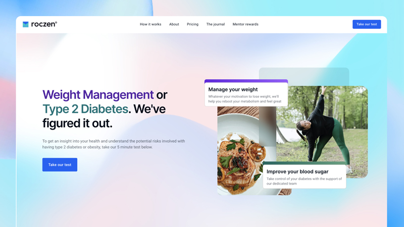
Practical use cases:
- Health and wellness: Choose a palette that communicates calm and vitality, such as soft greens and blues, and use human-centered photography to build trust and connection.
- Travel: Lead with high-quality images of real destinations, ideally from a consistent source, to build the excitement that drives bookings.
- Children’s education: Favor bright primary colors and friendly illustrations, and respect a young audience’s short attention span by keeping each screen simple.
- High-end restaurants: Invest in consistent, well-plated food photography and a clean, organized layout, which together signal quality and make choosing easier.
2. Typography and readability
Typography is one of the most underrated tools in web design, and it directly affects readability and engagement. The right combination of fonts, sizes, and contrast helps people absorb your message, while poor type choices quietly push readers away. Treat typography as a core part of the design, not an afterthought.
For a deeper look at this, see How to Design a Successful Education Website.
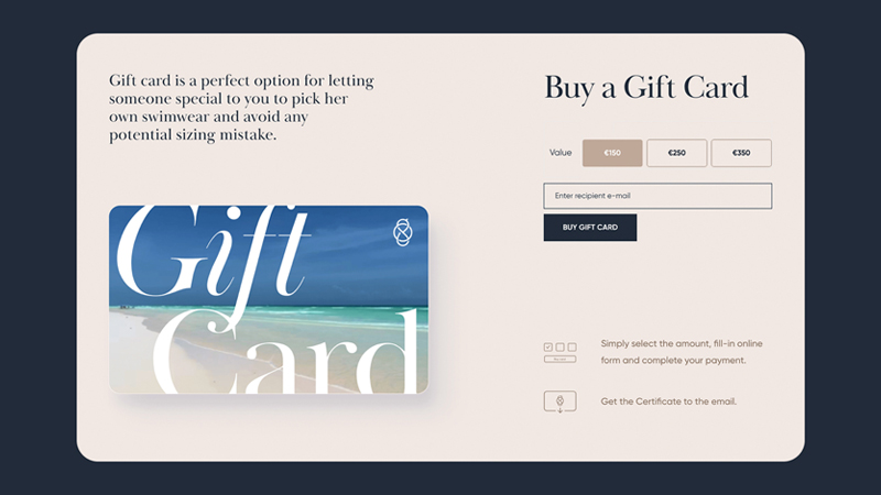
Practical use cases:
- Fashion: A chic display font for headings can capture attention, paired with a clean, easy-to-read secondary font for product copy and plenty of negative space.
- Tech startups: Modern, minimalist sans-serif fonts read as forward-looking, with bold or larger text used to highlight the information that matters most.
- News and media: Readability is paramount, so highly legible body fonts, big bold headlines, and strong contrast keep content accessible for every reader.
- Law and consultancy: Traditional serif or slab-serif type signals reliability, and ample line spacing makes dense, formal content easier to work through.
3. Navigation and layout
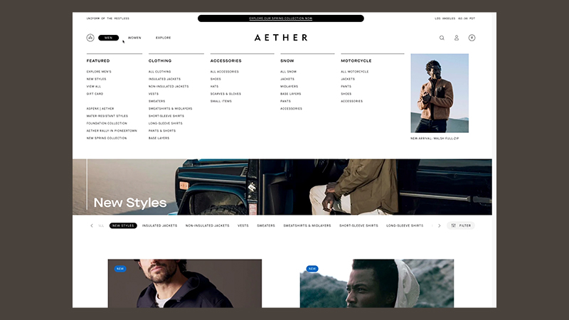
Navigation and layout determine how easily people move through your site, which makes them the backbone of usability. A well-structured site architecture guides visitors smoothly toward their goals and increases engagement, while a confusing menu sends them straight to a competitor. Plan the structure before you decorate the page.
Practical use cases:
- E-commerce: Large catalogs (think Amazon) rely on clear categories, subcategories, and breadcrumbs so shoppers always know where they are.
- E-learning: Platforms like Coursera and Khan Academy use simple menus, search, and filters so learners find the right course or topic fast.
- SaaS: A clean top navigation grouped into categories like Product, Customers, Resources, and Pricing lets prospects explore by intent without getting lost.
- Government: Information-dense sites such as usa.gov lean on structured submenus and prominent cards for the most-visited services, informed by site analytics.
This is also where a reusable system pays off. If you want the same intuitive structure on every page, a consistent set of building blocks makes that achievable, which is exactly why we use a design toolkit and page layouts on the sites we build. In our work with Sisense, an embedded analytics company, that meant building persona-aligned navigation for three distinct user types, developers, product managers, and executives, so each audience could reach relevant content without getting lost in a 3,600-page site.
4. Interactivity and engagement
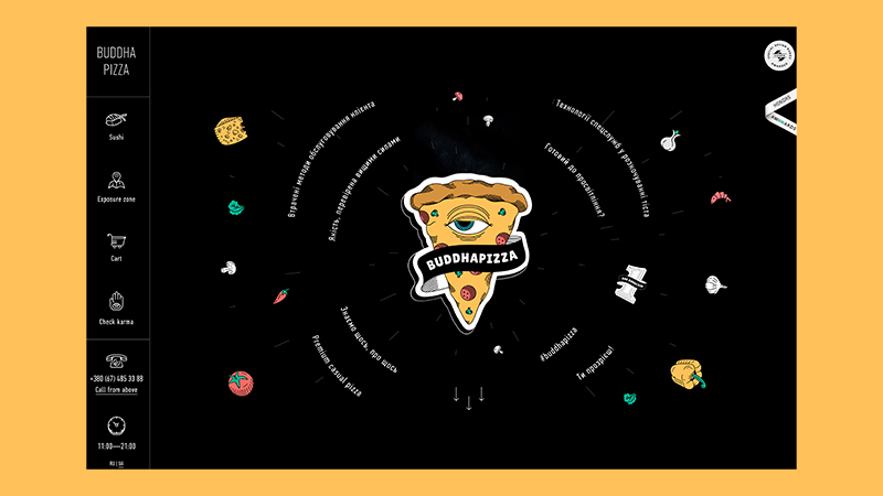
Interactivity is the level of two-way engagement a website offers, and it turns passive visitors into active ones. Elements like forms, buttons, sliders, and hover states invite people to participate, which raises satisfaction and retention. Used with intent, interactivity moves a visitor closer to a conversion.
For a closer look at how this plays out, see Edgy Website Design: 5 Reasons It Boosts Engagement.
Practical use cases:
- Real estate: A prominent contact or inquiry form on the homepage opens a direct line to prospects and increases qualified leads.
- Food and beverage: Interactive menus, where hovering a dish reveals a photo and description, make choosing more fun and give diners more confidence in their order.
- Beauty and retail: Clear, high-contrast calls to action like “Add to Cart” guide behavior, and a thoughtful hover or focus state makes the button feel responsive.
- EdTech: Quizzes, puzzles, and light gamification reinforce learning and keep users coming back, especially for younger audiences.
5. Responsiveness and mobile design
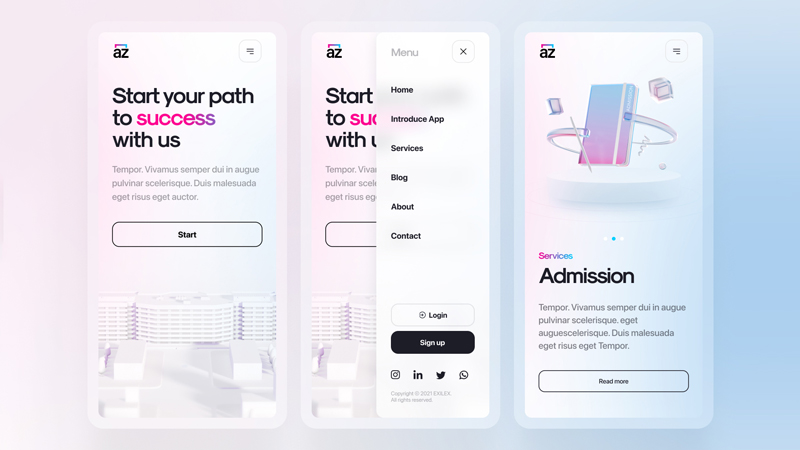
Responsiveness means your layout adapts to whatever device a visitor uses, and today it is non-negotiable. A responsive site adjusts its structure and elements for phones, tablets, and desktops to deliver a consistent, accessible experience everywhere. Because mobile usability is also a ranking factor, responsiveness protects both engagement and search visibility.
Practical use cases:
- Social platforms: Apps like Instagram are built mobile-first, prioritizing the small-screen experience their audience actually uses most.
- Large brands: Companies test across many devices and screen sizes, and tools like Hotjar help you see how real users behave on each one.
- Visual portfolios: Galleries and photography sites use responsive breakpoints (CSS media queries) so every image displays at its best on any screen.
- Healthcare portals: Accessibility is critical, so type scales and stays legible across devices, which is part of meeting website accessibility standards.
6. Usability and user experience (UX)
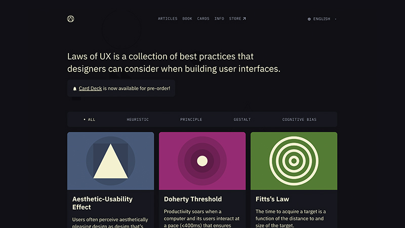
Usability and UX describe the overall feeling a visitor has when interacting with your site, and they tie every other element together. A site with strong UX is intuitive, easy to use, and meets expectations at each step, which leads to higher engagement and, usually, more revenue. When the experience is effortless, visitors stay and act.
Practical use cases:
- Nonprofits: A prominent “Donate” button leading to a short, step-by-step flow removes friction and protects the donations a mission depends on.
- Online banking: Clear form labels, tooltips, and inline validation guide users through high-stakes tasks like transfers with as little confusion as possible.
- Airlines: Schedules, prices, and seat availability are dense and time-sensitive, so fast load times and a clean flow are essential to keep bookings on track.
- Any B2B site: Optimize images, limit heavy web fonts, and simplify the design to reduce requests, because speed is a core part of a good experience.
When should you redesign your website?
Consider a redesign when the site actively works against your goals, not just when it looks dated. Clear signals include a high bounce rate within seconds, mobile conversions that trail desktop, a brand that has moved on from the current look, or a CMS your team can’t update without a developer. If two or more apply, a targeted refresh usually pays for itself faster than another round of patches.
Which website design element should you prioritize?
Every element matters, but knowing each one’s primary job helps you focus your time and budget. Use this comparison to see what each element controls and a quick signal that tells you it needs attention.
| Design element | Primary job | Sign it needs work |
|---|---|---|
| Visual design | Make a strong, on-brand first impression. | High bounce rate within seconds of landing. |
| Typography | Keep content readable and easy to scan. | Low time on page and shallow scroll depth. |
| Navigation and layout | Guide visitors to what they need. | Users can’t find key pages or your search spikes. |
| Interactivity | Invite action and increase engagement. | Forms and calls to action go unused. |
| Responsiveness | Deliver a consistent experience on every device. | Mobile conversions trail desktop badly. |
| Usability (UX) | Make the whole journey effortless. | Visitors drop off mid-task or abandon checkout. |
The takeaway: start with the element that maps to your weakest signal, then keep the others in balance. A single strong element rarely rescues a site, but one weak element can undermine all the rest.
Increase engagement with the right web design elements
A great website is the sum of its parts, and the six elements above are how those parts come together. From visual design and typography to navigation, interactivity, responsiveness, and usability, each one shapes how visitors experience your brand, and effective sites get all six working in concert rather than chasing one at a time.
We cover this in more depth in 7 Tired Web Design Trends That Make Your Site Look Dated.
Whether you’re starting your first design project or refreshing an established site, the goal is the same: a website that attracts visitors, earns their trust, and guides them to act. A well-designed site is a living extension of your brand, and it’s often the only first impression you get, so make it count.
Frequently asked questions
What are the main elements of website design?
The main elements are visual design, typography, navigation and layout, interactivity, responsiveness, and usability (UX). Visual design and typography shape perception, navigation and interactivity guide action, and responsiveness and UX make the experience consistent and effortless. Strong sites treat them as one connected system rather than a checklist.
What is the difference between good web design and attractive web design?
Attractive design looks good; good design also works. An attractive site can still bury its navigation, load slowly on mobile, or hide the call to action. Good web design pairs strong visuals with usability, so the page is easy to scan, quick to load, and clear about the next step. Aim for both, but never trade function for looks.
Why is responsive design so important for a website?
Responsive design adapts your layout to phones, tablets, and desktops so every visitor gets a consistent, accessible experience. Because most traffic is now mobile and Google factors mobile usability into rankings, a responsive site protects both engagement and search visibility. Without it, you lose visitors and visibility at the same time.
How quickly do users form an impression of a website?
Very quickly. According to Google Research, users build an initial “gut feeling” about a site in under 50 milliseconds, faster than a single blink. That snap judgment is driven mostly by visual design, and people consistently favor pages that look simple and familiar, so clean, on-brand visuals matter from the first moment.
What is the difference between UI and UX in web design?
UI (user interface) is what a visitor sees and interacts with, such as buttons, type, color, and layout. UX (user experience) is the overall feeling of using the site, including how easy and intuitive it is to reach a goal. Good UI supports good UX, but a polished interface still needs a frictionless experience behind it.
How many design elements does a good website need?
There is no magic number, but the six covered here, visual design, typography, navigation, interactivity, responsiveness, and usability, form a reliable foundation. Rather than maximizing any single element, aim for balance, since one weak area, like slow mobile performance, can undermine an otherwise excellent site.
How 3 Media Web can help
Balancing all six design elements while running day-to-day marketing is a tall order, and that’s where a partner helps. At 3 Media Web, our team builds sites that get visual design, typography, navigation, interactivity, responsiveness, and usability working together, guided by our Human and AI approach so expert judgment leads and the tooling supports it. In our work with Hum Capital, a fintech startup whose old site suffered from poor UX, slow load times, and an incongruent design, that combined approach, a cleaner design system, thoughtful page layouts, and mobile-optimized UX, drove a 39% increase in traffic and a 7% lift in conversion rate right after launch. That’s the foundation of our custom web design work and the broader way we build websites. If you’d rather hand off the heavy lifting, here’s what to expect from a website support partner.
Ready for a site that looks the part and converts? Reach out to our team to talk through your design goals.