
Think of web design as a fluid element. What was great web design years ago may not be up to today’s web design standards. That goes for both the style and the functionality. Even websites built within the last few years sometimes need some web design changes now and then.
If your website isn’t quite as fresh as it could be, there’s some good news. You may not need to scrap the entire site and start over. You may be able to update the web design to improve your website’s look, feel, and even functionality.
Even better news, some of the smallest tweaks you can make to your existing web design can make a BIG difference.
RELATED POST: B2B Web Design: How to Balance Beauty and Brains
Quick Tips To Know Before Updating Your Web Design
Below, we’ll be going over specific examples of small changes you can make to your web design. But before we dive right into the deep end, let’s take a moment to talk about some web design best practices.
Good Web Design Stems From Good Research
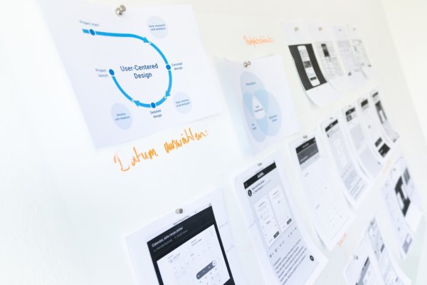
Before you address any web design project, it pays dividends to do a discovery phase. In the discovery phase, you will gather all kinds of vital information.
While the discovery phase builds web design projects based on the needs of company stakeholders, business goals, and other internal information, customer personas also play a major role in the process.
By examining and getting to know your customers fully, you will ensure you’re making the right changes to your web design to suit their needs.
Need a new website design that better fits the needs of your business and your customers? 3 Media Web’s team of web designers can help.
Simple Web Design Wins
First impressions count a lot! Don’t overwhelm visitors to your site with a busy interface that’s hard to navigate. Ask any web designer…Successful web design projects (big or small) require restraint and the ability to edit down.
I know, I know…it can be tempting to pack as much on a page as possible, but the numbers show it’s just not effective. A website’s design needs to be clean and straightforward. On the same note, your website’s navigation needs to be intuitive.
Good Web Design Is Consistent, Not Monotonous
A consistent style across a website’s pages gives the user a predictable experience. That’s a good thing! It helps them understand where to look for information and makes it easier to navigate the site.
However, it’s important to balance consistency with an artistic touch. In web design, artistic pops could be photos, videos, call-out boxes, etc. A good web designer will know how, where, and when to use these elements.
RELATED POST: Avoid These Common Web Design Mistakes
6 Small Web Design Tweaks That Make A Big Difference
Now that we’ve covered some best practices, let’s talk about some small but mighty web design tweaks you can use to give your website a little pick-me-up.
1. Update Your Fonts
For starters, look at the fonts you are using on your website. Then, answer the following questions:
How many different fonts are there?
You would be surprised by how much of a difference it makes to minimize the number of fonts your website uses.
In clean, impactful web design, two fonts sitewide work best.
One for the body text and a second font for headers that compliments the body text font.
These two fonts should be on every page of your website with text. Avoid using two fonts on the homepage, a different set of fonts on the about us page, and so forth. Two fonts for the entire site. That’s all you need to create a more seamless web design for your company site.
Yes, there are thousands of thousands of awesome fonts to choose from, but your job is to find two that look great together. When selecting your fonts, think about how they work together. Here are some things to consider:
- Try pairing a serif with a sans-serif font for a nice, balanced contrast
- Use a bold font for the header text and lighter font for the body copy

Are the fonts modern and easy to read?
This one should go without saying, but it’s essential, so let’s talk about it anyway. As stated, you must use readable fonts. If you’ve ever come across a website with a fancy script text that’s difficult to read, you know from a user’s experience why this one is a big one.
RELATED POST: Custom Website Design vs. Templates: Let’s settle this
If visitors to your site have to work to determine what the words on the page say, it’s pretty safe to say they won’t stick around very long.
What size are the fonts (including headers and body text)?
Now, on top of the style of your fonts being readable, your web design should feature fonts that are also large enough to read—on all kinds of devices. A 12px font was considered standard sizing in web design in earlier years. Well, times are changing!
Use a 14px for body text. You can even use a 16px or 18px font for short, punchy paragraphs like callout boxes. For headers, use a 24px to 32px font. Remember to keep the sizes consistent throughout the website whatever font size you ultimately land on.
2. Update the Visuals In Your Web Design
How old are the images and graphics on your website? Are they aging your site? It could be time to replace them with graphics that are more modern in design. When selecting what kinds of images to use on your site, here are a few pointers:

Consider the user’s interests. When selecting images for your website, don’t just choose images that appeal to you. Use images that appeal to your user base’s interests and relate to your company.
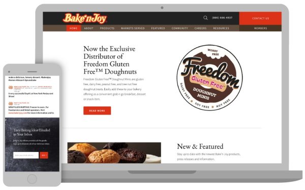
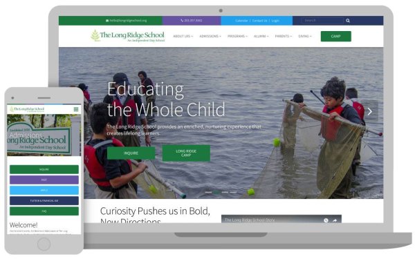
Use authentic photos. Rather than filling your site with staged stock photos, use photos that give an authentic feel. Hire a photographer to come into your workspace and take shots of real employees and staff members to populate the About Us page on your site.
Pay attention to file size. While you want the images and graphics on your site to be clear and sharp, don’t add too large images, or your page load speed will suffer. And when page load speed times go down, so do the number of visitors to your site.
Also, don’t go overboard with images. Ensure the images and graphics you use on your site are intentionally placed. That leads us to our next point—embracing whitespace.
3. Use Whitespace Wisely
This quote from Janis Krums of OPPORTUNITY sums this up perfectly.
“Chances are, you’ve cluttered areas of your website as new ideas and content have emerged over the years. Take some time to review what is critical to your business and what is not. Remove what isn’t, and find new, cleaner ways to present the refined content.”
Krums recommends identifying the most important sections of your website. Then figure out a way to create additional white space around those. This will ensure your web design is working to lead the user’s eye where it needs to go– looking at the important stuff.
4. Simplify Your Web Design
Have you ever heard of the phenomenon known as the “mere exposure effect”? The American Psychological Association (APA) defines it as: “the finding that individuals show an increased preference (or liking) for a stimulus as a consequence of repeated exposure to that stimulus.”
In other words, the more familiar a person is with something, the more they will like it.
What’s that have to do with web design?
A lot.
It turns out; there’s no need to reinvent the wheel or spend tons of resources coming up with creative, over-the-top ideas regarding web design.
According to the mere exposure effect theory, your web design is better than others in your market. You can make it your own by making it even simpler than the others.
And the push to move web design standards to become the industry baseline strengthens the argument.
RELATED POST: Crafting the Perfect UI Design for Your Website
5. Standardize The Buttons Throughout Your Entire Web Design
Speaking of web design standards, the buttons on your website should be standardized sitewide. Again, this is for consistency, which users respond positively to. But in addition to that, it also aids in usability and functionality.
Use the same color button for all the buttons on your site. Especially actionable buttons like “Add To Cart,” “Signup,” “Checkout,” and so forth. Keeping these the same throughout the site makes it easier for users to identify where they need to click.
Suppose you want to experiment with different colors. In that case, one way to incorporate a bi-color button palette into your web design is by having the buttons change color when a user hovers over them.
6. Freshen Up The Copy
Now, you might be wondering what copywriting has to do with web design. But the reality is website copy is just as important as the imagery. The entire point of website copy is to motivate users to act like some kind. Perhaps that will be to read additional blog articles, complete a purchase, or some other action.
Well, good web design has the same goal. Web design and copywriting go hand in hand.
Much like choosing imagery, you can follow a solid set of best practices when writing copy for your site.
First, make sure you use short sentences and short paragraphs. The last thing users want to encounter on a website is long walls of text. It comes off as daunting and unwelcoming. That’s why it pays to condense your message into digestible bits of information.
Pay attention to the tone of your copy. Ideally, it will complement the style of your website.
On top of that, remove jargon and confusing language. Assume you’re writing for a 6th-grade reading level.
Essentially, the copywriting on your website needs to satisfy the following statements:
- The copy on your website reflects that your company understands your customer’s needs.
- Clearly explains how your company’s products and services will benefit your customers.
- Creates a path forward to guide the user to the next step in their buyer journey.
If you can check off those three qualifications, your copywriting is off to a good start. You may also consider working with a professional copywriter. In some instances, your web design agency may even offer copywriting services.
RELATED POST: 3 Media Web Garners TWO 2019 W3 Silver Awards
Give Your Web Design A Facelift
Don’t judge a book by its cover. We’ve all heard that advice before. But, the advice is rarely heeded regarding web design changes. It takes a visitor to your site all of 50 milliseconds to form an opinion of your site.
You read that correctly. In just 0.05 seconds, a visitor to your site has already decided whether or not they will stay or click away.
If your website looks a little stale, you may not need to throw it all out and start over. Making a tweak here and there can help perk it up. Our web design experts are here to help you implement changes to your website quickly and efficiently. Get in touch with us today!